Tell us what you want :)
Comments
-
Divine_Death - Dreamweaver wrote: »Yeah, was good times back on the old forum when you were 4X posting SS QQing about getting pked/killed by mobs in sz. b:laugh
b:surrender the pk was at vol 17 where somehow sz is messed up there only place sz is near teleporter
b:surrender the mob was dodopod on angler village some1 lured while i was afk
b:surrender
EDIT : omg even smiles looks ugly with this layout now -.-[SIGPIC][/SIGPIC]0 -
Kittennice - Heavens Tear wrote: »

I got lazy with the word colorings but ya get the idea.
Omg exactly this, I was going to start working on one very similar to this. If we must have tideborn tattooed EVERYWHERE can we use this layout?
b:faint I'm calling it a night now because my head is throbbing agony.0 -
next maint: cash shop item to convert the forums back to the old way b:laugh0
-
"if it ain't broke, don't fix it"I was early taught to work as well as play,
My life has been one long, happy holiday;
Full of work and full of play-
I dropped the worry on the way-
And God was good to me everyday.0 -
I dont like it , now there is no clock which shows server time b:angryb:angryb:angry0
-
Kittennice - Heavens Tear wrote: »
This if we can't have old one.b:dirty[SIGPIC][/SIGPIC]
Why So Stupid?
Want a darker race? A race fighting for their humanity?
Go here
> pwi-forum.perfectworld.com/showthread.php?t=656132 You know you want to.
Anime! Anime! Oh PW Anime!
Coming Soon...0 -
Just put big picture of PWE design team and **** the the look, haha0
-
that's not a religious comment, not in the least.WaffleChan - Sanctuary wrote: »foxrunnning!
keep your religious garbage off these threads!I'm a guy, not a woman, that is all
"When you're on Team Bring it, every morning your feet hit the floor, the good lord says "good morning" and the devil says 'Oh **** they're up' " - Dwayne "The Rock" Johnson
Are you on Team Bring it?0 -
"The old one!"
No, just kidding.
But I would personally just like something a little less bright, darker colors seem to be better.0 -
why dont you just make it like you can switch according to your preference? its possible, i have seen it. coz i actually like this coz blue is my fav color + this loads faster =D0
-
Omg. Something less bright please. And don't get me started on editing your codes. -cracks fingers-
Edit: But then again, I'm too lazy. >.>[SIGPIC][/SIGPIC]
Siggy by Santacruz
.:theempire.ucoz.com:.0 -
http://i282.photobucket.com/albums/kk246/luminatingheart/Perfect%20World/IndexPSD.jpg
http://i282.photobucket.com/albums/kk246/luminatingheart/Perfect%20World/IndexPSD2.jpg
Or something like those colors. Got tired of editing halfway through and my WQ is almost over. Just something darker. A medium color or dark color, just not white.[SIGPIC][/SIGPIC]0 -
Hm i can't think much other than darker color . .
For me the old one look much more better b:surrender gold font, black background, icon positioning, easy to see interface, etc b:sad
Now it so bright . . i don't think i will last long reading forum now x.x[SIGPIC][/SIGPIC]
Sorry i speak engrish b:chuckle
Nickname doesn't have anything to do with sailor but related to a folklore
Use search, it was your best friends to avoid many suffering in internet...0 -
Kittennice - Heavens Tear wrote: »
I love love love the one Kittennice made. The only thing I'd like better is if the forum itself was wider.Saitada - Sanctuary wrote: »Go here, look at the colors. Think about it.
Or look at these colors here...
The former is more my preference, the latter an idea to build from. Now then, until these forums actually get fixed, I won't be posting anymore. You guys should really be ashamed of yourselves for even thinking something this crappy would be acceptable.
I'm going to go play a different game now. I doubt I will be back for a while.
~Saitada
I also love the color scheme from the first link Saitada posted. Darker but still could fit with the TB theme since that seems all you want to use. b:surrender Tapout 0
 -
b:victoryGrats to all who gives some advice to improve the looks of these *cough* "horrible" *cough* forums.
I suggest rainbows, lots and lots of rainbows, or blue, yes blue, i love blue, maybe something with a mix of red and black with a hint of purple and white.....hmm...Fire Lighting!b:scorn...We are one, We are many, We are watching you...b:scorn0 -
I know you said you didn't want us to say the old one, I'm just curious as to why. It's obvious that's what most of the community wants back.
This is a nice idea, and I appreciate the recognition that our outrage is getting, but honestly, the part that I dislike the most about this forum design is how generic it looks. And the submissions look very...square.
The older one had some nice design at the top and what not and that's kind of whats missing here.
But to be useful to the conversation, my favorite one that has been posted so far is Khalfani's elf one.0 -
I like the new layout. Except for the white. Its just too extreme.
Also, what Keph said, I'd love to see the integration of the rest of the races. The website and forums make it look like the game is all about the Tides, and they arent even fully implemented into the game lol[SIGPIC][/SIGPIC]0 -
why can't we get something like the BOI forums?
maybe different hues though, but that's VERY easy on the eyes like PWI USED to be
(picked a random thread)I'm a guy, not a woman, that is all
"When you're on Team Bring it, every morning your feet hit the floor, the good lord says "good morning" and the devil says 'Oh **** they're up' " - Dwayne "The Rock" Johnson
Are you on Team Bring it?0 -
I dont understand why everyone wants dark and depressing colors. A forum can be clean and streamlined, not just dark, gloomy and depressing to look at.
I think a alot of you are rude as hell, and should give the person(s) involved in revamping the website and forums some credit for at least trying to improve them. Coding the forums/website takes some time and effort.
Instead, you all are QQing like little babies without your lollipop and slamming whoever made it. Instead, give constructive criticism and help improve, not flame the designer.[SIGPIC][/SIGPIC]0 -
FootStep - Sanctuary wrote: »I know you said you didn't want us to say the old one, I'm just curious as to why. It's obvious that's what most of the community wants back.
This is a nice idea, and I appreciate the recognition that our outrage is getting, but honestly, the part that I dislike the most about this forum design is how generic it looks. And the submissions look very...square.
I'd wager they were asked to redesign the forum to reflect the new Rising Tide version of the game, which brings in all the blue and the images of TB chars.
Anyway, a less painfully white backing would be a good start b:victory I could live without the flashing advertisments as well, to be blunt.[SIGPIC][/SIGPIC]
Thanks for the sig Ophida 0
0 -
the old one was great....0
-
becuse white hurts most of our eyes. I loved the dark forums because they were very easy on my eyes, not because it was "dark and depressing"Ceshiari - Sanctuary wrote: »I dont understand why everyone wants dark and depressing colors. A forum can be clean and streamlined, not just dark, gloomy and depressing to look at.
I think a alot of you are rude as hell, and should give the person(s) involved in revamping the website and forums some credit for at least trying to improve them. Coding the forums/website takes some time and effort.
takes alot of time and effort? I could grab the CSS and rework it in under an hour, which is all they did, since BOI was already designed in this style, all they did was edit the codesI'm a guy, not a woman, that is all
"When you're on Team Bring it, every morning your feet hit the floor, the good lord says "good morning" and the devil says 'Oh **** they're up' " - Dwayne "The Rock" Johnson
Are you on Team Bring it?0 -
I have to agree on changing the colors to a darker tone. Staring at a bright white background does make my eyes hurt after a while, especially when it feels so overpowering. I think a darker color scheme would be much better because it wouldn't be as uncomfortable to look at for any length of time, and maybe just use the white to highlight smaller areas or to help offer a contrast to the darker colors.0
-
It might be my browser, i will have to go home and check again. but at the present time, the bottom banner is preventing me from viewing the whole forum. (as in i can't scroll the screen down at all.) it's rather annoying..0
-
how about something like this frankie.. it honours the old color scheme but keeping to the current design and tying in with the color scheme of the common menu bar at the top of every pwi page...
any thoughts peoples?

 [SIGPIC][/SIGPIC]
There is no place in a perfect world for double entendre!0 -
Ceshiari - Sanctuary wrote: »I dont understand why everyone wants dark and depressing colors. A forum can be clean and streamlined, not just dark, gloomy and depressing to look at.
I think a alot of you are rude as hell, and should give the person(s) involved in revamping the website and forums some credit for at least trying to improve them. Coding the forums/website takes some time and effort.
Instead, you all are QQing like little babies without your lollipop and slamming whoever made it. Instead, give constructive criticism and help improve, not flame the designer.
where the improve huh? WHERE b:angry
personally the web designer should be kicked in his **** from the office.
n now they asking the very own players to change the design instead of doing the job they being paid for.
there was no need to change the layout of forums i been in games which had same layout over 5 years.[SIGPIC][/SIGPIC]0 -
I decided to give it a try
[IMG][/img]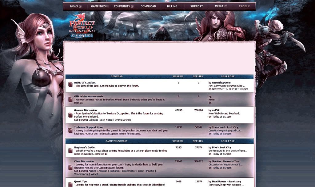 0
0 -
The old one.
(If it has to be new, the Elf one by what's-his-face)
P.S. Rankings.0 -
The old one plz. kthx[SIGPIC][/SIGPIC]0
-
I like the old one. This new one hurts my eyes like looking into the sun.
 0
0


This discussion has been closed.
Categories
- All Categories
- 182K PWI
- 699 Official Announcements
- 2 Rules of Conduct
- 264 Cabbage Patch Notes
- 61.1K General Discussion
- 1.5K Quality Corner
- 11.1K Suggestion Box
- 77.4K Archosaur City
- 3.5K Cash Shop Huddle
- 14.3K Server Symposium
- 18.1K Dungeons & Tactics
- 2K The Crafting Nook
- 4.9K Guild Banter
- 6.6K The Trading Post
- 28K Class Discussion
- 1.9K Arigora Colosseum
- 78 TW & Cross Server Battles
- 337 Nation Wars
- 8.2K Off-Topic Discussion
- 3.7K The Fanatics Forum
- 207 Screenshots and Videos
- 22.8K Support Desk