test content
Logo
What is the Arc Client?
Install Arc
Would you want LCARS type Forums?
 rcassandrasaturn
Member Posts: 195 Arc User
Would you want Forums to look great in LCARS style forums?
choose your vote below for each of different LCARS options.
remember to Leave a Comment below for your reason why you picked the option.
choose your vote below for each of different LCARS options.
remember to Leave a Comment below for your reason why you picked the option.
Fleet commander of Slippery When Wet.
i am Deaf Transgender girl. i'm Known to others as Korra.
you can find me on Tumblr, Twitter, Twitch
i am Deaf Transgender girl. i'm Known to others as Korra.
you can find me on Tumblr, Twitter, Twitch
Would you want LCARS type Forums? 91 votes
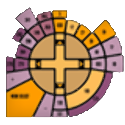
The Original Series ERA LCARS
0%
The Motion Picture ERA LCARS
0%
0
This discussion has been closed.













































Comments
Been around since Dec 2010 on STO and bought LTS in Apr 2013 for STO.
i am Deaf Transgender girl. i'm Known to others as Korra.
you can find me on Tumblr, Twitter, Twitch
That being said, I voted for the choice option. Everyone should have the right to use whichever theme they like best.
That said, practically anything would be better than what we have.
STO Resources: <Ship Comparison - All Tiers + Small Craft + Hangar Pets> <Damage Resistance>
<R&D + Upgrade Costs> <Duty Officer Finder> <Suliban Doff Reqs> <Fleet Costs> <Rep Costs>
<Keybind Tour the Galaxy> <Fleet / Armada Management> <Currency Exchange> <Other STO Links>
SUPPORTING PLAYABLE CARDASSIAN AND DOMINION FACTIONS!
BTW OP, your poll didn't have a selection for "No LCARS at all".
It doesn't need to have any sounds at all. It's looks are good enough for me.
SUPPORTING PLAYABLE CARDASSIAN AND DOMINION FACTIONS!
There are users here who don't speak English as a first language, so I'm going to treat that as real comment. 'Noisy' in graphic terms means too many irrelevant images (or other features) are displayed, overwhelming useful data.
The are two primary disadvantages:
No, I was actually thinking that you really meant the sounds (those little bips you can hear on the Federation starships), although now when I rethink about it, I understand my comment is kinda funny since there really are no sounds on forums in the most cases.
As for the irrelevant data, that could be easily excluded I guess. Besides I have already seen before some of the forums and sites with LCARS and they looked pretty decent without having much irrelevant pictures and data. A good example is that www.ditl.org page.
SUPPORTING PLAYABLE CARDASSIAN AND DOMINION FACTIONS!
My character Tsin'xing
It's an option. Just not one you want to pick.
nice ta see ya poking around here again
Personally, as to the "look" of the forums, I'd just make three changes:
1) Ability to disable embedding.
2) Different background for quotes.
3) Pagination at the bottom as well as top.
Cause then it would pretty much be the same as it was before the migration.
The big issue for me has been and will continue to be...Search.
What is wrong with what we have? I see a lot of "don't like" but not a lot of why.
Mostly doesn't bother me, but I would like to see larger avatars, text size on replies to the OP be larger, and demarcations between the post and the sig, and the sig and the flag/quote on the bottom. And of course Dev Tracker. But other than Dev Tracker, I won't be too bothered if the rest doesn't happen.
I agree. It was a hard act to follow after Wrath.
Same thing I was thinking here. "Real world" (I am using those words very loosely!)--I would expect Starfleet touch interfaces to look a little more like a souped-up version of iOS.
Christian Gaming Community Fleets--Faith, Fun, and Fellowship! See the website and PM for more. :-)
Proudly F2P. Signature image by gulberat. Avatar image by balsavor.deviantart.com.
To be honest, there are many things you don't want to use a touch interface for. You want a solid permanent physical control in front of you that's always in the same location. Things like a Master Arming Switch, Target Lock Confirmation, the big red Fire button, etc. I'd add in basic flight controls. If I was pilot, I'm sure I'd have a huge list.
Touch interfaces are prone to miss-keys. Add in possible smoke and confusion of battle obscuring one's vision- good hard physical controls are a requirement. You should be able to do basic actions even if blind.
LCARS dependency upon touch screen only technology was one of the things about the Enterprise D that screamed starliner- unsuited to warfare or even self defense against any but minor threats.
*Everything* has those very dangerous plasma conduits. That's why your entire crew is dead seconds after engaging in battle. Good thing we don't need them.
Don't use the can while flying too close to a nebula...
(Note: Addressing the lack of adequate circuit breakers is the first order of business. Once that's done, we could move on to the touchscreen discussion...)
Dunno if you have an iPhone, but there are certain essential functions that are "real push button only," so I would expect such supplements to the touch interfaces.
I would add one thing about flying blind, though--while we only saw it in one episode (VOY--"Year of Hell"), the option for a tactile interface even on the touch panels existed. IRL, the prototype is already with us, though undoubtedly still needing a lot of work to bring it to mass market: http://tactustechnology.com/ Like most effective technologies that can accommodate those with disabilities, my thought is that people would very quickly discover applications for those without disabilities as well. If it were me, I would expect tactile interfaces to not only be present, but be part of standard emergency procedure, if touchscreen tech ever gained wider use.
(And of course, don't forget Space Siri...
Christian Gaming Community Fleets--Faith, Fun, and Fellowship! See the website and PM for more. :-)
Proudly F2P. Signature image by gulberat. Avatar image by balsavor.deviantart.com.
Whats an LCARS? A Lexus...CAR(s)? a definition or a pic would be nice for those who are not really savvy on the terminology
Not the best examples, but this is what I found with a quick search.
Enterprise Era
TOS Era
TMP Era (Refit Enterprise)
TMP Era (Enterprise-A)
TNG era
Problem I have... I cannot navigate their website under any circumstances... I have to use the Mobile App to view it.
I vote Enterprise or Axanar.
sorry, i forgot to add that. Dx
i am Deaf Transgender girl. i'm Known to others as Korra.
you can find me on Tumblr, Twitter, Twitch
the reason, you don't want it is because they were poorly coded/set up and being lazy by the people.
unlike me, i actively work on my LCARS forums and improve them, making them more easier to use, user-friendly and custom-made.
with that being said, i could say that my forums look good over time when i do add changes/fixes to them. that my fleet loves.
i am Deaf Transgender girl. i'm Known to others as Korra.
you can find me on Tumblr, Twitter, Twitch
Better CSS would be neat. Quotes more legible, better visual structuring overall. Currently I am using Stylish to load up a custom CSS that someone posted on the boards, I've forgotten who. I'd prefer to not need that.
Good search and a dev tracker are really important.