[Discussion about the new UI]
Options
Comments
-
The new UI sucks, and it is obvious that it was not texted. Change it back.0
-
I think the new UI system sucks. I personally hate it and it gives me a headache to look at it. Already I have my settings to just online offline messages and whispers and that is because you cant turn whispers off. It needs to be fixed b4 people cant play because it causes them to be sick.0
-
So played the whole day in the new style and here is my second opinion on it:
First the chat window:
I've done the chat window one size bigger than the default one and now it is better to read.
The bigger
Edit:
AW where does my text go?????? O_O
Okay new short form off my nice text:
Status bar text: too big
Chat window: takes getting used to but i can live it it just made the chat window one size bier and its good to read
Quest book: VERY HARD TO READ!!! pls make new one or change it backI am from Germany and I am sorry if my English isn't very good b:surrender0 -
Ok let me just put it this way...Make it that this second UI is optional, so we can switch back and forth between the original UI and this "I am blind help me read pls UI".b:bye0
-
The linking system is something that this game has needed for a long time. I'm thrilled you put it in. On the other hand though the new chat and font system is absolutely horrid. The big tags in chat window stating whether its guild world private ect need to go. They are annoying and its kind of an insult to pwi players to assume we are so stupid as to not know the difference in color coding. The font is a bit too big too and could use some rescaling.0
-
Resize font size from everything .................. ASAP pls!
Linking system just let you add one item, this can be updated for more items at same post.
Chat definition box can be removed is useless making chats looks worse and stealing space, we dont really need it, we survived with chat colours and can survive without the box.[SIGPIC][/SIGPIC]
Arshies - Sanctuary0 -
No new font sucks[SIGPIC][/SIGPIC]0
-
I like this new Chat windows, but i need 5 min to decrypting my friend word
 perfectworldcommy.blogspot.com0
 -
Item linking is awesome! b:pleased
The font size is better, but you could have edited the boxes to fit the new font size. Maybe a tad smaller. But I find it a lot easier to read. Especially when whispering someone that isn't on your friends list. That blue is terrible on the eyes.
The tags are redundant, distracting and cluttering. Please remove the tags.[SIGPIC][/SIGPIC]
|Payne-tsu 93 |Queen-tsu 89 |Shadow-tsu 69
Pantsu b:dirty0 -
Revert the chat back to normal
Sort the DQ items out
Totally unfair on the TW
Sort the font out
Start listening to the people that actually play the game, afterall PWI would be nothing if it wasn't for the gamers. We spend really cash for items in the game, we keep you in jobs so to speak.
GM's please pass this onto the powers that be, i know you only get the flak when these things happen. (Unless your the reason for these things b:chuckle )0 -
I will write my complaint in a font size that I feel accurately describes how crowded and closed in I am feeling...
I think the new UI looks crowded and claustrophobic; I am not blind! It has messed up the genie too (right click it and see for yourself how the numbers overlap). The screen text is FAR too large. I can't track my quests without not being able to really see my screen properly, and the number for hp/mp are annoyingly large (for me, they distract me from watching my bar go down when I am dying).
If you're going to **** with the UI like this, I think there should be an option the revert back to the older version OR at least mae a font size option for the UI, not just the chat.
Speaking of that...
I like the new chat, MINUS the annoying chat labels. I'm not an idiot, nor am I a beginner who is easily confused by her different chats. I, and many others, are annoyed by having to see "WORLD", "NORMAL", etc cluttering our chat when we type. Get rid of that.
Keep the cool hyper stone clicker by the hp bar, trash the TW and market destroying mirage reawrds (seriously, what were you ppl thinking?! And right after people did their bidding?), and keep the option where ppl can see an item being advertised (i think that is really awesome).
But, I think I speak for all Perfect World when I say that you guys have a LOT of work to do.0 -
My eyes are bleeding.... after a few hours of playing... cause of the chat box thing.... b:cry
Besides the font being unpleasant to the eyes, all the buttons & different colours is just making me b:cry I can't keep track of who's writting what.[SIGPIC][/SIGPIC]0 -
everything is way too big, and it is unecesary. bring it back to what it used to be
The item linking is kind of usefull, but my guild spent about half an hour thismorning absolutely abusing the hell out of the system.0 -

That's not even the worst. b:chuckle[SIGPIC][/SIGPIC]0 -
Aeyris - Sanctuary wrote: »[...] and the number for hp/mp are annoyingly large (for me, they distract me from watching my bar go down when I am dying).[...]
The huge numbers over the HP/MP bars are bugging me too. Have had to click those circles to the left of the bars to switch on those little bars that show above your character's head (don't know the proper term for it) just to be able to easily see what percentage my HP/MP is. I've never liked those little bars but have no real choice other than risking death/wasting food. Hopefully it won't be long before all of this is fixed.0 -
X_Diogenes_x - Sanctuary wrote: »The huge numbers over the HP/MP bars are bugging me too. Have had to click those circles to the left of the bars to switch on those little bars that show above your character's head (don't know the proper term for it) just to be able to easily see what percentage my HP/MP is. I've never liked those little bars but have no real choice other than risking death/wasting food. Hopefully it won't be long before all of this is fixed.
I just kinda zone out when I play the game anyways. This new patch just encourages that. If I don't look at the numbers I can estimate how much HP I have left by how much red there is......@_@0 -
and so, the glorious death of pwi..
the once great game, diseased, infected.
b:cry0 -
Lenore - Harshlands wrote: »I just kinda zone out when I play the game anyways. This new patch just encourages that. If I don't look at the numbers I can estimate how much HP I have left by how much red there is......@_@
Same, that's what I would do before the patch. Now however, for me at least, it's difficult to see what percentages I'm at because there's white **** all over the bars. Missing how tidy it all looked before.0 -
Once again PWI staff took the voice of few and ignored the vast majority, while still not understanding the concept of OPTIONAL. I hate the new UI, its completely out of proportion and is useful only for people with bad eyesight, and an eyesore for those with good vision.
Thanks for once again meddling with the chat, something you should improve, not bring down as due to your incapability of adding proper content or fixing old one, has become 1 of the few reason players are still here: chatting with friends. Now its harder to do that.
I really hope you take your heads of your bums and bring back the old UI or at the very least make it optional, cuz this is just awful and i feel like playing less and less.PWI:
"Free to play. Pay to win"
[SIGPIC][/SIGPIC]0 -
The UI and the font the world, guild etc thing next to text is ****.
Change it back the way it was that's all.0 -
The item linking is kind of cool and, while it is currently annoying in its overuse, I think that will die down as the newness goes away.
The boxes are ugly and pointless. The color coding worked just fine and these are only distracting.
The font is too big. It's nice that we have an option to make it smaller in the chat window but I would prefer to have that option for all of it (friend list, quest log, etc) rather than having multiple font sizes across the screen.
Overall, not a good impression... It looks a little looney toons.0 -
Item linking is nice, found this to be very useful in **** (wups cant say that here :P)
Though the text change, and the *guild* *normal* icons are just annoying..go back to the old style please.0 -
Well, it needs work. Item linking is great. Text and tag... not so much.
Hey, but at least you added your current ping time and frames per second. That's actually nice.0 -
Ok this is easy fix the new ui so numbers be smaller or i quit.
I play this game in window mode and with this new font size pwi sucks.
Or make it so we can disable it.
I have put much money in this game and im very dissapointed now b:cry0 -
For anyone complaining about the size of the font (ignore the tags, the bleeding labels, etc for one second)
 Elena Costel: I wash my hands of this affair.
Legerity: *drags you back* *stains your hands with said affair*
Elena Costel: Noooo... I don't want to have a dirty affair with Lady Legerity...
Qui: b:dirty0 -
That doesn't fix the rest of the UI.
So PW knocks chatting and PW in the same day....what's left?0 -
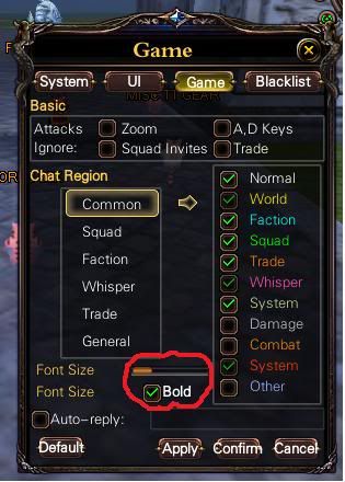
Its not the bold, its the size that is the problem. I have put my geni in inventory bc i get headache when i c the big numbers.
But the chatt window is nice") 0
0 -
Lenore - Harshlands wrote: »That doesn't fix the rest of the UI.
The **** do you want from me does it look like i work here?Elena Costel: I wash my hands of this affair.
Legerity: *drags you back* *stains your hands with said affair*
Elena Costel: Noooo... I don't want to have a dirty affair with Lady Legerity...
Qui: b:dirty0 -
Quilue - Sanctuary wrote: »The **** do you want from me does it look like i work here?
No, but several people have mentioned your solution already and what I said is only the truth. There's no need to be offended 9_9.0 -
LOLb:laugh
The text on monsters and boss is so big so it cant be inside the name box. Fugmas name is about half my screen.0


![http://i125.photobucket.com/albums/p64/cherry_nicole/baby.jpg[/SIGPIC]](http://i125.photobucket.com/albums/p64/cherry_nicole/baby.jpg[/SIGPIC])
This discussion has been closed.
Categories
- All Categories
- 181.9K PWI
- 692 Official Announcements
- 2 Rules of Conduct
- 264 Cabbage Patch Notes
- 61K General Discussion
- 1.5K Quality Corner
- 11.1K Suggestion Box
- 77.4K Archosaur City
- 3.5K Cash Shop Huddle
- 14.3K Server Symposium
- 18.1K Dungeons & Tactics
- 2K The Crafting Nook
- 4.9K Guild Banter
- 6.6K The Trading Post
- 28K Class Discussion
- 1.9K Arigora Colosseum
- 78 TW & Cross Server Battles
- 337 Nation Wars
- 8.2K Off-Topic Discussion
- 3.7K The Fanatics Forum
- 207 Screenshots and Videos
- 22.8K Support Desk