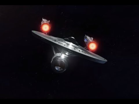
To be fair, smoke, I don't think you'd find many of us who had a problem with the design of the TOS Connie. The issue is really with the lack of detail (which doesn't mean we want grebling to make a Star Destroyer blush). Even that remaster you're linking isn't exactly like the "60s" ship. For a start, it has the Aztec pattern, which wasn't ever seen until TNG in the '80s. It has lit warp grills, which the original show didn't have. It has service floods, visible phaser banks, etc. And it looks much better alongside today's VFX than the old balsa wood model TOS used while keeping the same basic design.
(On a side not, just about the only thing I don't like about that remaster is the lack of hull panelling. I know people say it looks more hi-tech as one large piece, but the TMP model had large hull panels, as has every Federation design since, including the NX-01. TOS is the outlier. I honestly prefer the various remasters (including the Art Asylum replicas) which featurge the TMP-style hull panel lines. It doesn't have to be all over the place, just a few seams showing where hull segments have been locked together.)
rattler2Member, Star Trek Online ModeratorPosts: 58,696Community Moderator
I'm with ryan on this.
I don't hate the TOS design. I think its pretty good. But to try and push her in as is next to modern graphics, she shows her age big time. But without her... we wouldn't have any other ship ever seen period.
Give the classic some of the same details like we see in later versions of Trek, like the mentioned aztecing and glowing field grills, and she comes back to life in a big way.
Its the little things that can make big improvements.
I still feel that the Discovery variant is a good incarnation that also stays true to the original, but I understand not everyone agrees. To each their own after all. I respect that.
I can't take it anymore! Could everyone just chill out for two seconds before something CRAZY happens again?!
The nut who actually ground out many packs. The resident forum voice of reason (I HAZ FORUM REP! YAY!)
normal text = me speaking as fellow formite colored text = mod mode
Expect the look to slightly change with better graphics...then again the Connie was made to work not be the ship equivalent of a fashionista...
i always liked the origional connie because it always has a realistic deflector dish, although the kelvin connie has a decent take on a modern connie IMO
I'll break from the mold, I HATE the TOS version of the Connie and have always thought it was ugly as sin since I first saw it as a kid in the '90s. The ST: Discovery version is superior in every way imaginable, infact I even like it more than the TMP version. That fan recreation does nothing to change my mind on this.
EDIT: So the language filter now changes the three letter abbreviation for Star Trek Discovery to TRIBBLE? How lame.
People were using the abbreviation as a disparagement to associate it with venereal disease, and the official abbreviation is ST: DSC (like VOY, DS9, ENT, etc.). Not saying I agree with it (in my opinion, all it's accomplished is making people use even more childish nicknames for the show).
I'll break from the mold, I HATE the TOS version of the Connie and have always thought it was ugly as sin since I first saw it as a kid in the '90s. The ST: Discovery version is superior in every way imaginable, infact I even like it more than the TMP version. That fan recreation does nothing to change my mind on this.
EDIT: So the language filter now changes the three letter abbreviation for Star Trek Discovery to TRIBBLE? How lame.
Yeah, I agree. The remaster here in this video looks better than the original, but the DISCO Connie beats the TOS Connie and completely blows the Kelvin Connie out of the water. And yeah, I think I like it better than TMP as well. The only TOS ships I've seen that actually look decent are some of the ones from Agents of Yesterday.
When DS9 did their Tribble time travel episode they vastly improved the D7 by giving it a feather pattern on the hull and a green tint but didn't also improve the basic and lifeless looking Conni.
Adding visible plasma, metallic material, and Aztecing would at least make it fit slightly better in the style of literally every other Starfleet ship in Trek.
As it stands TOS is the embarrassing midlife crises between the ENT and DSC past and the TMP-VGR future. Where for some reason they stripped everything of detail and shape and painted it stupid colours.
Unfortunately the basic and lifeless TOS version persists in DS9 and ENT meaning the DSC version will have to revert at some point.
Though TOS:R ignored DS9s revamp of the D7 so maybe DSC can ignore TOS:Rs devamp of the Conni tough I get the feeling that fanboi pressure is going to force the producers to make necessary changes because any and all change has them breaking out into little fits.
Unrelated, it's hilarious the forum censor is not treating the edgelords special acronym as the bollocks it is and either forcing them to use the correct form of abbreviations used for all other series or else have it highlighted how pathetic their 'exceptionalism' one TV series out seven is.
Norway and Yeager dammit... I still want my Typhoon and Jupiter though. JJ Trek The Kelvin Timeline is just Trek and it's fully canon... get over it. But I still prefer TAR.
#TASforSTO
'...I can tell you that we're not in the military and that we intend no harm to the whales.' Kirk: The Voyage Home
'Starfleet is not a military organisation. Its purpose is exploration.' Picard: Peak Performance
'This is clearly a military operation. Is that what we are now? Because I thought we were explorers!' Scotty: Into Darkness
'...The Federation. Starfleet. We're not a military agency.' Scotty: Beyond
'I'm not a soldier anymore. I'm an engineer.' Miles O'Brien: Empok Nor
'...Starfleet could use you... It's a peacekeeping and humanitarian armada...' Admiral Pike: Star Trek
To be fair, smoke, I don't think you'd find many of us who had a problem with the design of the TOS Connie. The issue is really with the lack of detail (which doesn't mean we want grebling to make a Star Destroyer blush). Even that remaster you're linking isn't exactly like the "60s" ship. For a start, it has the Aztec pattern, which wasn't ever seen until TNG in the '80s. It has lit warp grills, which the original show didn't have. It has service floods, visible phaser banks, etc. And it looks much better alongside today's VFX than the old balsa wood model TOS used while keeping the same basic design.
(On a side not, just about the only thing I don't like about that remaster is the lack of hull panelling. I know people say it looks more hi-tech as one large piece, but the TMP model had large hull panels, as has every Federation design since, including the NX-01. TOS is the outlier. I honestly prefer the various remasters (including the Art Asylum replicas) which featurge the TMP-style hull panel lines. It doesn't have to be all over the place, just a few seams showing where hull segments have been locked together.)
to me, smoothness is more. *holds up a modern ipad* all smooth, no greebles or kibble.
I go with the Doug Drexler way of thinking.
To be fair, smoke, I don't think you'd find many of us who had a problem with the design of the TOS Connie. The issue is really with the lack of detail (which doesn't mean we want grebling to make a Star Destroyer blush). Even that remaster you're linking isn't exactly like the "60s" ship. For a start, it has the Aztec pattern, which wasn't ever seen until TNG in the '80s. It has lit warp grills, which the original show didn't have. It has service floods, visible phaser banks, etc. And it looks much better alongside today's VFX than the old balsa wood model TOS used while keeping the same basic design.
(On a side not, just about the only thing I don't like about that remaster is the lack of hull panelling. I know people say it looks more hi-tech as one large piece, but the TMP model had large hull panels, as has every Federation design since, including the NX-01. TOS is the outlier. I honestly prefer the various remasters (including the Art Asylum replicas) which featurge the TMP-style hull panel lines. It doesn't have to be all over the place, just a few seams showing where hull segments have been locked together.)
I prefer seeing no phasers visible. I prefer seeing something far advanced beyond the standard way of thinking.
The TOS remastered is fine. I am not big on Aztecing, I feel it's sorta overrated. I personally prefer a smooth as glass surface. And I picture the hull being luminescent as well, no need for exterior spot lights.
I like to go with Arthur C. Clark's three laws
When a distinguished but elderly scientist states that something is possible, he is almost certainly right. When he states that something is impossible, he is very probably wrong.
The only way of discovering the limits of the possible is to venture a little way past them into the impossible.
Any sufficiently advanced technology is indistinguishable from magic.
To me, the connie of TOS says those.
I always seen the tos hulls and stuff not being welded together by sweat guys with welding torches (that bit in the first JJ trailer makes me LAUGH....like ship building is gonna stay the same after 1950), but:
Woven - Like a spider web, or silk worms. In the TOS Novel, Wounded Sky, which was the basis for one of my favorite, all time Trek episodes ever, Where No One Has Gone Before, the Starfleet ships and stations had hulls that were made from crystalline threads being woven together, and making them mega strong (Seeing how the Enterprise took a nuclear blast in Balance of Terror, or Anti-Proton in The Doomsday Machine, it would have to be mega strong).
Grown - I can see either a nano base or some sorta of culture, even, growing on the frame. I think one of the Dr. Who stories said a Tardis can be essentially grown.
Printed - Kinda like Leeloo was printed in the 5th Element.
Manifested - A beam of energy sweeping over the frame, even making the frame as well, and each sweep, more matter is being manifested, think like a replicator on steroids. Or no energy beam, and the stuff just starts to appear.
To be fair, smoke, I don't think you'd find many of us who had a problem with the design of the TOS Connie. The issue is really with the lack of detail (which doesn't mean we want grebling to make a Star Destroyer blush). Even that remaster you're linking isn't exactly like the "60s" ship. For a start, it has the Aztec pattern, which wasn't ever seen until TNG in the '80s. It has lit warp grills, which the original show didn't have. It has service floods, visible phaser banks, etc. And it looks much better alongside today's VFX than the old balsa wood model TOS used while keeping the same basic design.
(On a side not, just about the only thing I don't like about that remaster is the lack of hull panelling. I know people say it looks more hi-tech as one large piece, but the TMP model had large hull panels, as has every Federation design since, including the NX-01. TOS is the outlier. I honestly prefer the various remasters (including the Art Asylum replicas) which featurge the TMP-style hull panel lines. It doesn't have to be all over the place, just a few seams showing where hull segments have been locked together.)
to me, smoothness is more. *holds up a modern ipad* all smooth, no greebles or kibble.
I go with the Doug Drexler way of thinking.
Smoothness is the boring way to show futuristic. The Iconian ships and the ships from Jupiter Ascending look far better than the TOS Constitution. The only smooth ship I have ever liked is from Flight of the Navigator.
See, Smoky, that's the part you need to concentrate on. "To me". That means you're expressing an opinion. Your opinions aren't facts. Hell, my opinions aren't facts, as well-reasoned as I may think them to be.
Full disclosure - I've always had a soft spot for the Great Gray Lady; there's always something special about your first. I loved the TMP revamp. And I want a Disco Connie with the fire of a thousand Wolf-Rayet suns, but if it goes into a lockbox I'm sadly probably not ever getting one (I have really bad luck with RNGs, and have given up trying).
Smoothness is the boring way to show futuristic. The Iconian ships and the ships from Jupiter Ascending look far better than the TOS Constitution. The only smooth ship I have ever liked is from Flight of the Navigator. https://www.youtube.com/watch?v=1G13KzEJqBw
The interesting thing with THAT ship is that it's hull is covered with mimetic polyalloy. So the smooth surface isn't aesthetic, it has a functional reason for being there.
isn't most of a nuclear weapon's damage caused by the blast and heat wave? both of which need atmosphere to propagate and which does not exist in space
so claiming being able to survive a nuclear detonation in space as evidence of resilience is...foolish, at best
A normie goes "Oh, what's this?"
An otaku goes "UwU, what's this?"
A furry goes "OwO, what's this?"
A werewolf goes "Awoo, what's this?"
"It's nothing personal, I just don't feel like I've gotten to know a person until I've sniffed their crotch." "We said 'no' to Mr. Curiosity. We're not home. Curiosity is not welcome, it is not to be invited in. Curiosity...is bad. It gets you in trouble, it gets you killed, and more importantly...it makes you poor!"
Passion and Serenity are one.
I gain power by understanding both.
In the chaos of their battle, I bring order.
I am a shadow, darkness born from light.
The Force is united within me.
See, Smoky, that's the part you need to concentrate on. "To me". That means you're expressing an opinion. Your opinions aren't facts. Hell, my opinions aren't facts, as well-reasoned as I may think them to be.
Full disclosure - I've always had a soft spot for the Great Gray Lady; there's always something special about your first. I loved the TMP revamp. And I want a Disco Connie with the fire of a thousand Wolf-Rayet suns, but if it goes into a lockbox I'm sadly probably not ever getting one (I have really bad luck with RNGs, and have given up trying).
Dude, you don't get lockbox ships by opening lockboxes. That way lies madness. You grind for EC and then buy the ship off the exchange.
Smoothness is the boring way to show futuristic. The Iconian ships and the ships from Jupiter Ascending look far better than the TOS Constitution. The only smooth ship I have ever liked is from Flight of the Navigator. https://www.youtube.com/watch?v=1G13KzEJqBw
The interesting thing with THAT ship is that it's hull is covered with mimetic polyalloy. So the smooth surface isn't aesthetic, it has a functional reason for being there.
And its transformation is why I used a video of it instead of just an image. The ship is voiced by Paul Reuben which is better known as Pee-wee Herman. There are the White Star and Vorlon ships from Babylon 5, but they use a mottled smooth look rather than just a smooth look.
I'll break from the mold, I HATE the TOS version of the Connie and have always thought it was ugly as sin since I first saw it as a kid in the '90s. The ST: Discovery version is superior in every way imaginable, infact I even like it more than the TMP version. That fan recreation does nothing to change my mind on this.
Well said, and totally agreed. The original Connie is horrendous in every way.. Discovery actually made it look kinda cool.
that's because now it looks like a real starship, not like a model made out of plastic and balsa wood...oh wait - the original model WAS made out of plastic and balsa wood!
A normie goes "Oh, what's this?"
An otaku goes "UwU, what's this?"
A furry goes "OwO, what's this?"
A werewolf goes "Awoo, what's this?"
"It's nothing personal, I just don't feel like I've gotten to know a person until I've sniffed their crotch." "We said 'no' to Mr. Curiosity. We're not home. Curiosity is not welcome, it is not to be invited in. Curiosity...is bad. It gets you in trouble, it gets you killed, and more importantly...it makes you poor!"
Passion and Serenity are one.
I gain power by understanding both.
In the chaos of their battle, I bring order.
I am a shadow, darkness born from light.
The Force is united within me.
I like all the Connies but TMP the best...Disco Connie second
Your pain runs deep.
Let us explore it... together. Each man hides a secret pain. It must be exposed and reckoned with. It must be dragged from the darkness and forced into the light. Share your pain. Share your pain with me... and gain strength from the sharing.
that's because now it looks like a real starship, not like a model made out of plastic and balsa wood...oh wait - the original model WAS made out of plastic and balsa wood!
Define 'real'.
Just because it looks like dirty, brushed steel does not look real to me.
A normie goes "Oh, what's this?"
An otaku goes "UwU, what's this?"
A furry goes "OwO, what's this?"
A werewolf goes "Awoo, what's this?"
"It's nothing personal, I just don't feel like I've gotten to know a person until I've sniffed their crotch." "We said 'no' to Mr. Curiosity. We're not home. Curiosity is not welcome, it is not to be invited in. Curiosity...is bad. It gets you in trouble, it gets you killed, and more importantly...it makes you poor!"
Passion and Serenity are one.
I gain power by understanding both.
In the chaos of their battle, I bring order.
I am a shadow, darkness born from light.
The Force is united within me.
that's because now it looks like a real starship, not like a model made out of plastic and balsa wood...oh wait - the original model WAS made out of plastic and balsa wood!
Define 'real'.
Just because it looks like dirty, brushed steel does not look real to me.
Comments
(On a side not, just about the only thing I don't like about that remaster is the lack of hull panelling. I know people say it looks more hi-tech as one large piece, but the TMP model had large hull panels, as has every Federation design since, including the NX-01. TOS is the outlier. I honestly prefer the various remasters (including the Art Asylum replicas) which featurge the TMP-style hull panel lines. It doesn't have to be all over the place, just a few seams showing where hull segments have been locked together.)
Trials of Blood and Fire
Moving On Parts 1-3 - Part 4
In Cold Blood
I don't hate the TOS design. I think its pretty good. But to try and push her in as is next to modern graphics, she shows her age big time. But without her... we wouldn't have any other ship ever seen period.
Give the classic some of the same details like we see in later versions of Trek, like the mentioned aztecing and glowing field grills, and she comes back to life in a big way.
Its the little things that can make big improvements.
I still feel that the Discovery variant is a good incarnation that also stays true to the original, but I understand not everyone agrees. To each their own after all. I respect that.
But like I said, the little details add up.
normal text = me speaking as fellow formite
colored text = mod mode
i always liked the origional connie because it always has a realistic deflector dish, although the kelvin connie has a decent take on a modern connie IMO
Mwahahahahahahaha
EDIT: So the language filter now changes the three letter abbreviation for Star Trek Discovery to TRIBBLE? How lame.
Trials of Blood and Fire
Moving On Parts 1-3 - Part 4
In Cold Blood
Yeah, I agree. The remaster here in this video looks better than the original, but the DISCO Connie beats the TOS Connie and completely blows the Kelvin Connie out of the water. And yeah, I think I like it better than TMP as well. The only TOS ships I've seen that actually look decent are some of the ones from Agents of Yesterday.
Adding visible plasma, metallic material, and Aztecing would at least make it fit slightly better in the style of literally every other Starfleet ship in Trek.
As it stands TOS is the embarrassing midlife crises between the ENT and DSC past and the TMP-VGR future. Where for some reason they stripped everything of detail and shape and painted it stupid colours.
Unfortunately the basic and lifeless TOS version persists in DS9 and ENT meaning the DSC version will have to revert at some point.
Though TOS:R ignored DS9s revamp of the D7 so maybe DSC can ignore TOS:Rs devamp of the Conni tough I get the feeling that fanboi pressure is going to force the producers to make necessary changes because any and all change has them breaking out into little fits.
Unrelated, it's hilarious the forum censor is not treating the edgelords special acronym as the bollocks it is and either forcing them to use the correct form of abbreviations used for all other series or else have it highlighted how pathetic their 'exceptionalism' one TV series out seven is.
Norway and Yeager dammit... I still want my Typhoon and Jupiter though.
JJ Trek The Kelvin Timeline is just Trek and it's fully canon... get over it. But I still prefer TAR.
#TASforSTO
'...I can tell you that we're not in the military and that we intend no harm to the whales.' Kirk: The Voyage Home
'Starfleet is not a military organisation. Its purpose is exploration.' Picard: Peak Performance
'This is clearly a military operation. Is that what we are now? Because I thought we were explorers!' Scotty: Into Darkness
'...The Federation. Starfleet. We're not a military agency.' Scotty: Beyond
'I'm not a soldier anymore. I'm an engineer.' Miles O'Brien: Empok Nor
'...Starfleet could use you... It's a peacekeeping and humanitarian armada...' Admiral Pike: Star Trek
Get the Forums Enhancement Extension!
to me, smoothness is more. *holds up a modern ipad* all smooth, no greebles or kibble.
I go with the Doug Drexler way of thinking.
I prefer seeing no phasers visible. I prefer seeing something far advanced beyond the standard way of thinking.
The TOS remastered is fine. I am not big on Aztecing, I feel it's sorta overrated. I personally prefer a smooth as glass surface. And I picture the hull being luminescent as well, no need for exterior spot lights.
I like to go with Arthur C. Clark's three laws
When a distinguished but elderly scientist states that something is possible, he is almost certainly right. When he states that something is impossible, he is very probably wrong.
The only way of discovering the limits of the possible is to venture a little way past them into the impossible.
Any sufficiently advanced technology is indistinguishable from magic.
To me, the connie of TOS says those.
I always seen the tos hulls and stuff not being welded together by sweat guys with welding torches (that bit in the first JJ trailer makes me LAUGH....like ship building is gonna stay the same after 1950), but:
Woven - Like a spider web, or silk worms. In the TOS Novel, Wounded Sky, which was the basis for one of my favorite, all time Trek episodes ever, Where No One Has Gone Before, the Starfleet ships and stations had hulls that were made from crystalline threads being woven together, and making them mega strong (Seeing how the Enterprise took a nuclear blast in Balance of Terror, or Anti-Proton in The Doomsday Machine, it would have to be mega strong).
Grown - I can see either a nano base or some sorta of culture, even, growing on the frame. I think one of the Dr. Who stories said a Tardis can be essentially grown.
Printed - Kinda like Leeloo was printed in the 5th Element.
Manifested - A beam of energy sweeping over the frame, even making the frame as well, and each sweep, more matter is being manifested, think like a replicator on steroids. Or no energy beam, and the stuff just starts to appear.
Smoothness is the boring way to show futuristic. The Iconian ships and the ships from Jupiter Ascending look far better than the TOS Constitution. The only smooth ship I have ever liked is from Flight of the Navigator.
https://www.youtube.com/watch?v=1G13KzEJqBw
But I don't think the problem with the TOS Enterprise is the lack of greebles, it's more that it's sort of awkward and gangly in its shape.
Any sufficiently advanced technology is indistinguishable from magic.
To me, it's elegant. And with the above line, it might look fragile, but with material and techniques beyond what we think of, could be mega strong.
Same for the Universe class.
Full disclosure - I've always had a soft spot for the Great Gray Lady; there's always something special about your first. I loved the TMP revamp. And I want a Disco Connie with the fire of a thousand Wolf-Rayet suns, but if it goes into a lockbox I'm sadly probably not ever getting one (I have really bad luck with RNGs, and have given up trying).
My character Tsin'xing
so claiming being able to survive a nuclear detonation in space as evidence of resilience is...foolish, at best
#LegalizeAwoo
A normie goes "Oh, what's this?"
An otaku goes "UwU, what's this?"
A furry goes "OwO, what's this?"
A werewolf goes "Awoo, what's this?"
"It's nothing personal, I just don't feel like I've gotten to know a person until I've sniffed their crotch."
"We said 'no' to Mr. Curiosity. We're not home. Curiosity is not welcome, it is not to be invited in. Curiosity...is bad. It gets you in trouble, it gets you killed, and more importantly...it makes you poor!"
I didn't say the TOS Enterprise looked fragile, I said it looked awkward. The Universe class totally does look fragile, though.
Dude, you don't get lockbox ships by opening lockboxes. That way lies madness. You grind for EC and then buy the ship off the exchange.
And its transformation is why I used a video of it instead of just an image. The ship is voiced by Paul Reuben which is better known as Pee-wee Herman. There are the White Star and Vorlon ships from Babylon 5, but they use a mottled smooth look rather than just a smooth look.
Well said, and totally agreed. The original Connie is horrendous in every way.. Discovery actually made it look kinda cool.
#LegalizeAwoo
A normie goes "Oh, what's this?"
An otaku goes "UwU, what's this?"
A furry goes "OwO, what's this?"
A werewolf goes "Awoo, what's this?"
"It's nothing personal, I just don't feel like I've gotten to know a person until I've sniffed their crotch."
"We said 'no' to Mr. Curiosity. We're not home. Curiosity is not welcome, it is not to be invited in. Curiosity...is bad. It gets you in trouble, it gets you killed, and more importantly...it makes you poor!"
https://www.youtube.com/watch?v=SQCArh_R9dY
The merchandising, of course!
My character Tsin'xing
Let us explore it... together. Each man hides a secret pain. It must be exposed and reckoned with. It must be dragged from the darkness and forced into the light. Share your pain. Share your pain with me... and gain strength from the sharing.
Define 'real'.
Just because it looks like dirty, brushed steel does not look real to me.
#LegalizeAwoo
A normie goes "Oh, what's this?"
An otaku goes "UwU, what's this?"
A furry goes "OwO, what's this?"
A werewolf goes "Awoo, what's this?"
"It's nothing personal, I just don't feel like I've gotten to know a person until I've sniffed their crotch."
"We said 'no' to Mr. Curiosity. We're not home. Curiosity is not welcome, it is not to be invited in. Curiosity...is bad. It gets you in trouble, it gets you killed, and more importantly...it makes you poor!"
Define 'real'.
Just because it looks like dirty, brushed steel does not look real to me.
Whatever you say, oh wise one, whatever you say.