test content
Logo
What is the Arc Client?
Install Arc
DOFF UI Feedback Thread *Post 7/22 Patch*
 thomasp94232
Member Posts: 129 Arc User
thomasp94232
Member Posts: 129 Arc User
I already posted this in the "RE: DOFF UI" thread, but since that thread is getting so long I think it would be better to have a new one to make sure all the still existing issues get seen. If there is somewhere better to post my feedback (Since Al seems to think that the forums are nothing but pointless rants) then please let me know so that I can post it there.
Feedback after 7/22 Holodeck patch:
Known Issues & Problems:
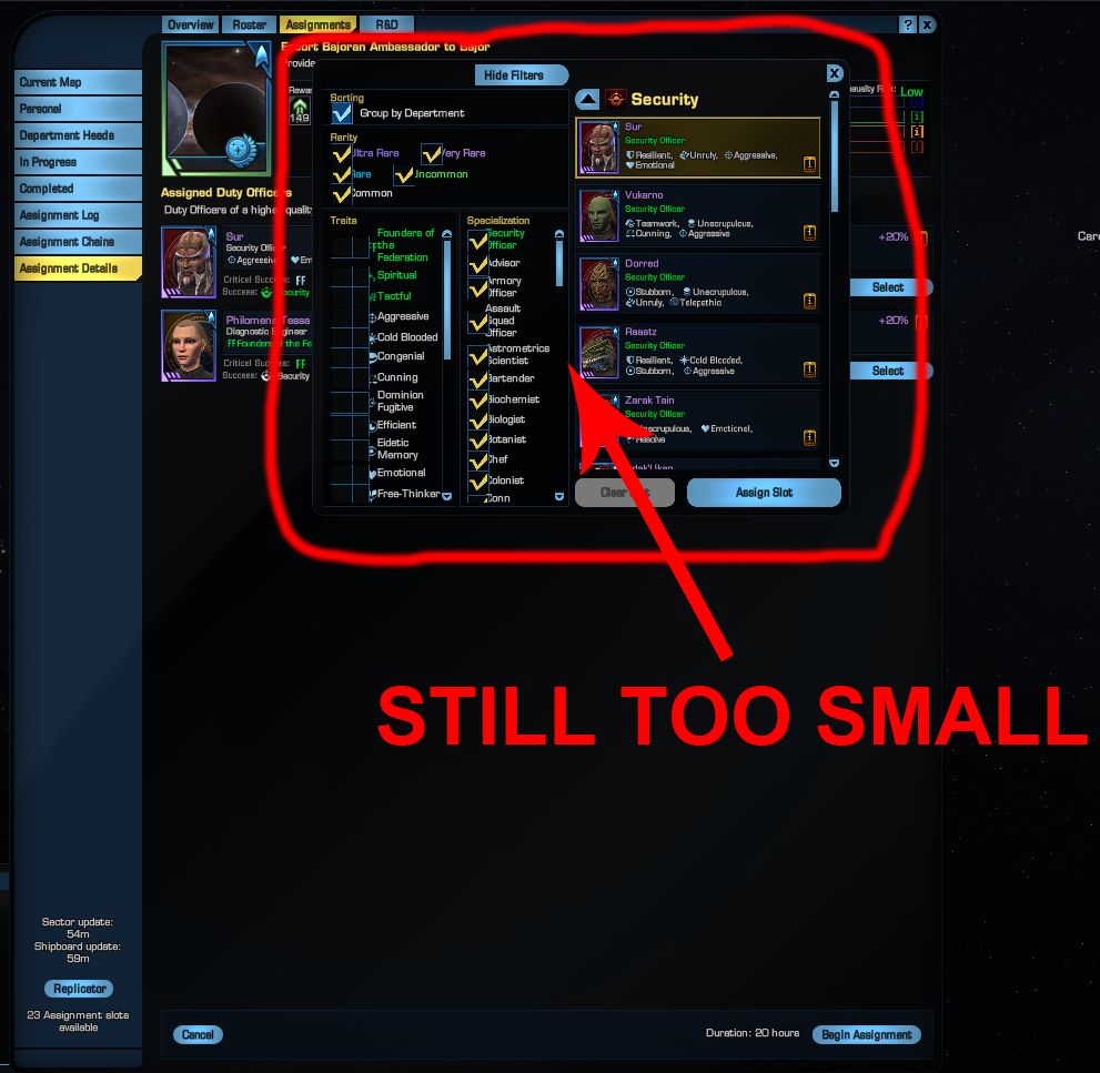
-The officer selection screen is too small.
Example photo ---> http://i398.photobucket.com/albums/pp62/thomasp94/Star%20Trek%20Online/WTF/DOFF_TOO_SMALL_zps2455e7ec.jpg
Ideally the officer selection should not be a separate pop-up, it should be in the existing DOFF window, like it used to be. IF it is not possible to have the officer selection take place in the existing window and instead the selection pop-up window is made resizable then IT MUST remember the size a user makes it and IT MUST remain that size indefinitely. We don't want to be having to resize the selection window every single time it pops up.
-The officer selection window is still showing officers already assigned to the project. Once an officer is assigned to the project it should not still be showing up as available in the selection window.
-The auto selection algorithm is selecting officers for assignments that do not match the success criteria for that assignment. One example is "Assist With Demolitions for Dilitium Mining". For success focus with no chance of disaster you want explosive expert officers but the system is suggesting other officers with higher disaster chances even though I have proper ones to use. Granted, the auto selected officers give a higher crit, but should the system not also take disaster chance into account and try to minimize it?
See example photos below:
Auto doff selection ---> http://i398.photobucket.com/albums/pp62/thomasp94/Star%20Trek%20Online/WTF/doff_before_zps0830422f.jpg
Manual doff selection ---> http://i398.photobucket.com/albums/pp62/thomasp94/Star%20Trek%20Online/WTF/doff_after_zps1a14f959.jpg
-When manually selecting officers for a mission once rarity check boxes are unchecked they need to stay unchecked. Currently all the rarity boxes are checked every time the selection window pops up, it should remember our previous settings and keep them until either we launch the mission or close out of the doff assignments window.
-The check boxes for rarity appear to be "laggy". I find that I'm having to click on the same box several times to get it to un-check.
-The in progress list of projects needs to sort by time to completion with those ending soonest at the top of the list.
-Once you have filled all your available assignment slots there needs to be some kind of graphical element on the assignment screen to let you know that you have done so. Whether this is greying out the PLAN button or just adding red around the missions I don't care, but we need something, just like the old UI had.
-Greying out the PLAN button (or otherwise) of missions that you don't have the requirements to start would be a good idea so long as a user can still see the requirement information so that they know what they need to start it.
-The new UI doesn't allow for interface scaling. We need the ability to scale down the interface without having overlap and jitter issues in the new DOFF UI.
UI jitter example ---> http://youtu.be/0NXhPcuGCpg
Additional Suggestions:
-The pie chart was far easier to read and took up less space. Please give us the option to change between the new slider chart and the old pie chart. And the game should remember our selection indefinitely.
-It would be nice to be able to see how many commodities we have available in the assignment requirements. For example a display that reads something like "4/50" the 4 would be what the assignment requires, the 50 would be how many we have in our bank/inventory.
-Put the star/exploration clusters back in the game. What was the point of removing them, what purpose did it serve other than a nerf to doffing? At the very least you need to give us back all the doff missions that have been taken away. those clusters used to have way more than the 6-7 colonial missions you are giving us now, there were unique missions in almost all the departments, especially engineering and operations. We want them back!
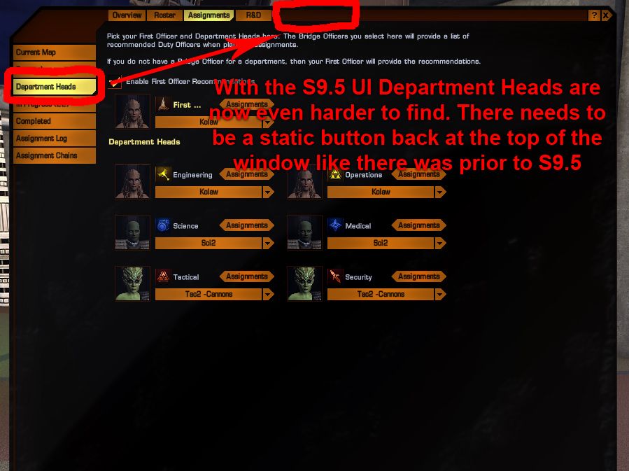
-With the Season 9.5 UI, Department Heads are now even harder to find. Depending what screen you are in you might have to click though several different windows/screen just to get back to the point where you can find the Department Head button. There needs to be a static button back at the top of the window like there was prior to season 9.5.
Example photo ---> http://i398.photobucket.com/albums/pp62/thomasp94/Star%20Trek%20Online/WTF/DOFF_Dept_Heads_zps0977e7ce.jpg
Feedback after 7/22 Holodeck patch:
Known Issues & Problems:
-The officer selection screen is too small.
Example photo ---> http://i398.photobucket.com/albums/pp62/thomasp94/Star%20Trek%20Online/WTF/DOFF_TOO_SMALL_zps2455e7ec.jpg
Ideally the officer selection should not be a separate pop-up, it should be in the existing DOFF window, like it used to be. IF it is not possible to have the officer selection take place in the existing window and instead the selection pop-up window is made resizable then IT MUST remember the size a user makes it and IT MUST remain that size indefinitely. We don't want to be having to resize the selection window every single time it pops up.
-The officer selection window is still showing officers already assigned to the project. Once an officer is assigned to the project it should not still be showing up as available in the selection window.
-The auto selection algorithm is selecting officers for assignments that do not match the success criteria for that assignment. One example is "Assist With Demolitions for Dilitium Mining". For success focus with no chance of disaster you want explosive expert officers but the system is suggesting other officers with higher disaster chances even though I have proper ones to use. Granted, the auto selected officers give a higher crit, but should the system not also take disaster chance into account and try to minimize it?
See example photos below:
Auto doff selection ---> http://i398.photobucket.com/albums/pp62/thomasp94/Star%20Trek%20Online/WTF/doff_before_zps0830422f.jpg
Manual doff selection ---> http://i398.photobucket.com/albums/pp62/thomasp94/Star%20Trek%20Online/WTF/doff_after_zps1a14f959.jpg
-When manually selecting officers for a mission once rarity check boxes are unchecked they need to stay unchecked. Currently all the rarity boxes are checked every time the selection window pops up, it should remember our previous settings and keep them until either we launch the mission or close out of the doff assignments window.
-The check boxes for rarity appear to be "laggy". I find that I'm having to click on the same box several times to get it to un-check.
-The in progress list of projects needs to sort by time to completion with those ending soonest at the top of the list.
-Once you have filled all your available assignment slots there needs to be some kind of graphical element on the assignment screen to let you know that you have done so. Whether this is greying out the PLAN button or just adding red around the missions I don't care, but we need something, just like the old UI had.
-Greying out the PLAN button (or otherwise) of missions that you don't have the requirements to start would be a good idea so long as a user can still see the requirement information so that they know what they need to start it.
-The new UI doesn't allow for interface scaling. We need the ability to scale down the interface without having overlap and jitter issues in the new DOFF UI.
UI jitter example ---> http://youtu.be/0NXhPcuGCpg
Additional Suggestions:
-The pie chart was far easier to read and took up less space. Please give us the option to change between the new slider chart and the old pie chart. And the game should remember our selection indefinitely.
-It would be nice to be able to see how many commodities we have available in the assignment requirements. For example a display that reads something like "4/50" the 4 would be what the assignment requires, the 50 would be how many we have in our bank/inventory.
-Put the star/exploration clusters back in the game. What was the point of removing them, what purpose did it serve other than a nerf to doffing? At the very least you need to give us back all the doff missions that have been taken away. those clusters used to have way more than the 6-7 colonial missions you are giving us now, there were unique missions in almost all the departments, especially engineering and operations. We want them back!
-With the Season 9.5 UI, Department Heads are now even harder to find. Depending what screen you are in you might have to click though several different windows/screen just to get back to the point where you can find the Department Head button. There needs to be a static button back at the top of the window like there was prior to season 9.5.
Example photo ---> http://i398.photobucket.com/albums/pp62/thomasp94/Star%20Trek%20Online/WTF/DOFF_Dept_Heads_zps0977e7ce.jpg
I've been here since beta
Post edited by thomasp94232 on
0
Comments
Officers the algorithm selected ---> http://i398.photobucket.com/albums/pp62/thomasp94/Star%20Trek%20Online/WTF/doff_fail_rate_before_zps179ba06b.jpg
Officers I manually selected ---> http://i398.photobucket.com/albums/pp62/thomasp94/Star%20Trek%20Online/WTF/doff_fail_rate_after_zps476bc15f.jpg
This isn't so much a problem for us with purple/very rare doffs since they can't die. But I don't think noobs are going to care too much for the duty officer system when their green and white doffs keep dying because the algorithm is broken.
I've been here since beta
Agreed. Having to remember which officer was used while searching through 300 others is just not fun.
Not sure this will change. Folks say this new system makes better selections than the old system. This is simply not true. The old system focused on success and only success and it suggested them, it did not choose them for you. This new system focuses on maximizing crit and auto-populates for you. Here is the problem with focusing on crit, 100% of the missions you want success, of those, a portion you want to crit and will give up a little disaster to get the higher crit.
Agreed on both. The check boxes seemed to take a half second or so to respond.
Also, the doff selection UI is now bigger and still does not move.
When clicking on either the brig or passengers, I get a complete listing of my doffs (similar to roster window). Bottom says proper number (10 of 20 prisoners, 13 of 20 passengers) but I have no way short of scrolling the entire list to see what prisoners or colonists are available or on assignment.
Just me or is this system wide? Also, please move to appropriate subforum, this looks as good of a place as any to post it.
1. Filters needs to have Specialisation unchecked, it is a pain to have to manually uncheck all boxes to just list 1 or 2 specialisations, especially as you have the needed doff specialisation listed at the top for each doff assignment.
2. We need a Species filter alongside traits and specialisation so we can find specific doffs easier (e.g Bajorans with 3 traits for cxp exchange)
3. Doffs need to be removed from the available list once they are slotted, especially important when you have multiple doffs of the same name otherwise this is a guessing game to which one is slotted
4. Doff assignments need to be fixed so all are slottable
5. Grey out the Plan button if we are missing doffs/items needed to start it
6. Reduce the number of boxes in 'Require' for doffs by doing the same thing you do for commodities and having a number required in the box. this would mean less scrolling to see missing items
7. In Progress tab needs to be sorted by time to completion like the old UI and not random as it currently is
Everything else sounds like a good fix, but as I responded elsewhere on the idea of greying out the Plan button... ...we still need access to information that can no longer be previewed without using the Plan button. As far as the actual sorting/filtering, it's an improvement, sort of, but having all of the doff selection one-at-a-time is very inconvenient; if you could... ...it would be a major improvement. Even more so would be to take the pop-up (with the suggested additions) and simply advance the doff UI to that screen, rather than incessantly adding more UI elements to clutter the screen; the bar chart would have to be carried over to make that work, but it would greatly help slim down the current design's clutter.
I've been here since beta
- Quality of officer
- Number of desirable traits to achieve a critical
- Type of officer needed to achieve a success
This means that, for instance, if you have a mission that calls for 3 Research Lab Scientists to achieve a 'success' result, (but does not absolutely require Research Lab Scientists), the assigning AI no longer simply finds 3 Research Lab Scientists to assign from your roster.
If you, say, have a multiple Purple doffs that have more critical traits than all of the Research Lab Scientists on your roster, the AI will fill those slots with those doffs that have a higher failure chance and ignore the doffs on the roster that are the type actually needed to achieve success.
This change especially affects mission types that are structured as follows: 1 doff with a specialization requirement + 2 or more ANY OFFICERS, but a certain specialization gives a higher chance of success.
What this means:
Be extremely careful before you you start the mission and take the time to look at your success chances. If you know that you've run the mission before with 0% failure chance, the game has not filled the mission with optimal doffs and you will have to hunt for the ones you need to fill it with. Prior to this patch, the AI was relatively intelligent and did not tank your doff mission chances of success. After this patch, this new priority system seems to have been implemented.
Prior to this patch, following the expansion, I was forced to change the AI's selection on approximately 25% of my doff assignments for the day. Following the patch, I set 40 missions on 2 characters and was forced to change the game's choices for the mission on 39 of them.
Thanks
In regards to greying out the plan button, I think that is something that should most definitely happen once you have filled all your available assignment slots. I'm so used to the assignment list having a visual effect to let you know once you fill all 23 slots that since this one doesn't I keep trying to start another missing.
As for greying out missions that you don't qualify for, I wouldn't mind having that happen so long as a user can get the requirement information that they need to start it.
I've been here since beta
And that's what some people asked for. What they need to do now is have a way to choose what to prioritize, either critical success at the chance of increased failure or success with less risk.
It's pretty much impossible to have one system that pleases everybody, they need to put in more options pretty much everywhere.
Its harder to find the right DOFF for the missison.
The Filter Window is terribly place and organized.
The new windows lag the game down significantly.
And I have no idea why everything has to be checked on (every position is on, should be the other way).
PLEASE BRING BACK THE OLD DOFF UI! :mad:
2. Officers assigned need to be REMOVED from the selection list
3. STATUS needs to be added to the filter menu
Ex-CoH players, Please add the chat channel "CoX STO"
Here's uniquely after 22.7.2014 patch feedback:
Toi'Va, Ti'vath, Toivia, Ty'Vris, Tia Vex, Toi'Virth: Add Tier 6 KDF Carrier and Raider.
Tae'Va, T'Vaya, To'Var, Tevra, T'Vira, To'Vrak: Give us Asylums for Romulans.
Don't make ARC mandatory! Keep it optional only!
Could we please have a stealth update that has all the jobs are unchecked at the start? That would be really helpful.
I was glad to see that a filter system was being added in this mornings patch notes. Of course, I fired it up and found that the ball was dropped again. I would rather be able to opt out of the @#$%! suggestions provided by the algorithm and select doffs the way I have been doing all along. That is unlikely to happen (someone is way to proud of horking this thing up for them to admit it is poorly implemented).
I would settle for the filter being turned off except for the professions actually requested by the mission.
Anyway, been looking for the giant hate thread on the old system. You know, the one with page after page of folks saying how they hate the original doff ui... "grrr, I hate critical thinking, gimme a one click solution!" thread. Can't seem to find it. Anyone know where it went? Surely they did not destroy a system that worked and worked well which was also tied into a revenue stream because they needed something to do.
P.S. - Bought Smedbucks yesterday, not zen. And yes, this doff system is exactly the reason. After-all, without doffing the game becomes a part time mmo which allows me more time for PS2.
http://sto-forum.perfectworld.com/showthread.php?t=1175961
the new filter are a small step in the right way, but still not work right.
Seriously, should we really uncheck all to get the one group we want? --> make at least a uncheck all botton.
By the way the filter are not so much needed if the auto selection would work good!!!!
Also, the Tau Dewa Aid doff mission mission on Suliban freighters is broken. It appears but will not launch.
Furthermore some doff missions are still MIA since the department head mission in exploration clusters was removed so they need to be put into the exploration node rotation (specifically the 6h KDF maurader missions)
The timer also appears to continue to be on the DH timer with a 20h rotation instead of the previous 4 hour routation. This makes any of the chains incredibly difficult to find and complete.
are the casual players they're pandering to that stupid or is it just cryptic not caring that once said casual players have dropped 10 bucks and moved along that the doff ui is unimportant ?
1) Something that the new system has inherited from the old. It would be swell that if i close a drop down list, it would stay closed.
Let's say i have 5 more slots and i need sci cxp. I close tactical, security, eng, ops ... drop down thingies so i get to the sci stuff. start my mission...et voila all is back fully extended.
2) the new suggestion mode is not really better then the old one, just different. either
a) make the new suggestion only kick in after a success chance is 100%, or
b) give us the choice to optimize for success or crit chance with a single click inside the UI.
otherwise the new list of doffs just makes this a major time consuming hazzle. I used to doff a lot, its gotten a lot less.
a history of sto pvp: 2010 - 2011
a history of sto pvp: 2012 - 2013
But all the changes they've made to the DOff system - If you go under "Overview" tab and open up Diplomatic under Commendation progress...
Rank 1 still lists "Unlocks Diplomatic Star Cluster Missions" - Star Clusters have been removed from the game.
Rank 3 still lists "Unlocks First Contact Missions In Star Clusters" and "Recieve first First Contact Mission" - again, Star Clusters have been removed
Rank 4 still lists "FDC votings rights on Deep Space 9 - Select diplomatic envoys for periodic visits" - ...This hasn't even been in the game for close to two years, just that I know of, and probably longer.
While all the clean-up and fiddling is in progress, why not do something about that while they're at it?
^Words that every player should keep in mind, especially whenever there's a problem with the game...
http://sto-forum.perfectworld.com/showpost.php?p=18064101&postcount=178
1. The doff selection window does not remember which filters I selected. If I close the selection window, then the checkboxes for rarity, traits, and specialization are reset. Some assignments have multiple slots with the same parameters. You should be able to set the filters once and apply the same settings to multiple slots. Oddly, the selection window remembers whether "Group by Department" is selected, as well as whether the filters are hidden or shown.
2. I cannot move or resize the doff selection window, regardless of whether the filters are shown or not. Furthermore, when the filters are shown, the selection window obscures the main doff window from view. This might actually be acceptable if the traits and specializations influencing different outcomes were shown above the filters. See the next point.
http://i.imgur.com/dDDEKvL.jpg
3. In the doff selection window, green is used for both success and critical success, and red is used for both failure and disaster. This makes it hard to tell which outcome an attribute (i.e., a trait or specialization) actually influences. A green attribute may influence success or critical success; a red attribute may influence failure or disaster. Moreover, an attribute may influence two different outcomes at the same time. For example, in the assignment "Assemble Heavy Antiproton Turret from Prototype", the trait "Stubborn" increases the chance of both critical success and disaster. You cannot color an attribute both green and red at the same time. In the screenshot below, "Stubborn" is colored red, but I don't know if this behavior is consistent. I suggest that you show the assignment outcomes and the attributes which influence them above the filters. That way, all the important information can be seen in the doff selection window without referring back to the main window. Another possibility is highlighting the currently selected slot in the main window, but in order to see it, you have move the selection window so that it doesn't block the main window from view.
http://i.imgur.com/80lzLR9.jpg
4. It is possible to create a situation in which the filters are shown, but the "Hide Filters" button is hidden. This situation is likely the unintended side effect of two intended behaviors: (i) hiding the "Show Filters" button when too few doffs meet the slot's requirements and (ii) remembering the visibility of the filters. I will illustrate with the assignment "Introduce Research on Agrobiological Processes".
(a) I start by planning the assignment "Introduce Research on Agrobiological Processes".
http://i.imgur.com/DJo9pXM.jpg
(b) Next, I click the "Select" button on the first slot. I have only three botanists, so the "Show Filters" button is hidden. This behavior is probably intended.
http://i.imgur.com/eztzRjE.jpg
(c) I close the doff selection window and then click the "Select" button on the second slot. I have many scientists, so the "Show Filters" button is visible.
http://i.imgur.com/3zvlAh7.jpg
(d) I click on the "Show Filters" button. The selection window shows the filters as intended.
http://i.imgur.com/G3MaUaJ.jpg
(e) Now, I close the selection window and click the "Select" button on the first slot. The filters remain visible, but the "Hide Filters" button is hidden.
http://i.imgur.com/LbNludb.jpg
If the filters are visible, I suggest that you show the "Hide Filters" button regardless of how many doffs meet the slot's requirements.
5. The red icon in the requirements box shows the total amount required by the assignment, but not how many you already possess. For example, in the screenshots below, the red icon shows that "Defuse" Abandoned Orbital Mine Field" requires 5 shield generators, but it doesn't show that I already have 2 shield generators in my inventory. I suggest that you change the red icon to show 2/5, but make the text a different color so that it is easy to read against a red background.
http://i.imgur.com/KylUsMX.jpg
http://i.imgur.com/cUfom9N.jpg
6. The next to the bar for critical success is dark blue, and the next to the bar for disaster is dark red. These colors are hard to distinguish against a black background. I suggest that you switch to lighter shades of blue and red.
http://i.imgur.com/uR0At53.jpg
7. In the "Overview" tab, a bug is causing CXP values greater than 100,000 to appear smaller than those less than 50,000. See the bug report below for further details.
CXP font size too small in "Overview" tab of doff window
8. The following usability problems remain.
Bugs
"View Details" shows wrong doffs
Missing doff portraits in "Assignment Log", "In Progress", and "Assignment Details"
Assignment outcome overlaps with text "Result:"
Cannot drag horizontal scrollbar in "Assignment Details" tab
CXP font size too small in "Overview" tab of doff window
http://i.imgur.com/3hjug1w.jpg?1
I have been seeing this as well, it's odd. If you cancel and go back in then it work. Another bug.
I've been here since beta
No sad, very, very sad.