test content
What is the Arc Client?
Install Arc

Rotating my siggy
sandukutupusandukutupu Member Posts: 2,285 Arc User
edited June 2018 in Art and Fiction
Since the rules don't allow for animated signatures, I made these up and plan to rotate through them weekly.
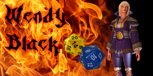

Silvane Stardust
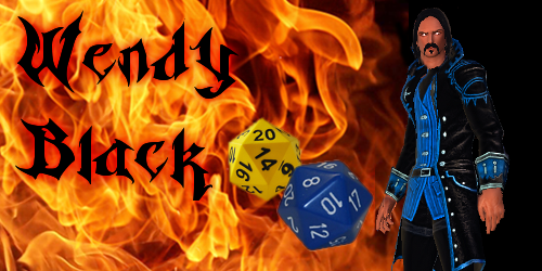
Nicholas Magnus
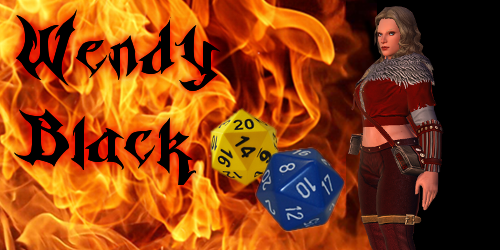
Hladgred Lothbrok
Will Robert Snooks
Aero Ironcrown
Dirk Anvil Slade
Llorna Zorg

Not pictured here; Goro Thay but I am working on it.
wb-cenders.gif
Post edited by sandukutupu on

Comments

  • sandukutupusandukutupu Member Posts: 2,285 Arc User
    According to a forum moderator... I was wrong and I can have an animated signature. In your opinion is this too much?


    Do you find this annoying? Distracting? YOUR opinion matters to me.
    wb-cenders.gif
  • dupeksdupeks Member Posts: 1,789 Arc User

    According to a forum moderator... I was wrong and I can have an animated signature. In your opinion is this too much?


    Do you find this annoying? Distracting? YOUR opinion matters to me.

    I do find the flames too much. I think if it was more subtle (some parts smoldering, glowing, or embers?) then it would be less distracting.

    I'm assuming you're also working on rotating through the characters, but you want to get the style worked out.

  • sandukutupusandukutupu Member Posts: 2,285 Arc User
    Yes, and I don't want people to be annoyed and distracted by it. I have seen too many signatures that look like a Disco Trauma Center on Acid.
    wb-cenders.gif
  • kreatyvekreatyve Member, Neverwinter Moderator, NW M9 Playtest Posts: 10,545 Community Moderator
    Yeah, we allow animated signatures as long as they aren't seizure inducing or too distracting. I like the one with the animated flames.
    My opinions are my own. I do not work for PWE or Cryptic. - Forum Rules - Protector's Enclave Discord - I play on Xbox
    Any of my comments not posted in orange are based on my own personal opinion and not official.
    Any messages written in orange are official moderation messages. Signature images are now fixed!
    kuI2v8l.png
  • kisakeekisakee Member Posts: 193 Arc User


    Do you find this annoying? Distracting? YOUR opinion matters to me.

    It's to fast i think, too eye catching.
    r9jtqurw.jpg

  • kriptical1kriptical1 Member Posts: 284 Arc User
    Agree with the speed of the fire being too fast. Slow it down and darken it about 10-15% and it should be cool.
  • kriptical1kriptical1 Member Posts: 284 Arc User
    edited September 2018
    JUst darken the fire. The eye will always be attracted to the brightest spot in the frame and right now your fire is the hero and I’m guessing your shooting for your hero being the hero of the shot
  • micky1p00micky1p00 Member, NW M9 Playtest Posts: 3,594 Arc User
    edited September 2018
    Speed was mentioned, distracting.

    If to reduce the speed I would have reduced it extremely, slower than a regular slow motion shot, otherwise you have 3 static object at the front, and the animation only makes them look more static, more slapped, and out of place, instead of augmenting them.

    An example of a composition can be using very very slow flames and a bit stronger smoke animation, behind the objects. Or another example is to use the animation (flame) alpha channel (transparency) or if it doesn't have one, use the black as one, and put the items behind the fire and lowering the flames a bit.

    Here is an example of using static pictures and adding an animation to them, there are several pictures over the course of the video, notice how sometimes specific objects have effects while the rest is static.
    https://www.youtube.com/watch?v=FuoK-Z3mTC4

    Here even more subtle example but of the same idea
    https://www.youtube.com/watch?v=45kf3GiKOP8

    And here notice the subtle smoke and the slight bend on the umbrella showing wind
    https://www.youtube.com/watch?v=o0TZgKbUL7s
  • frozenfirevrfrozenfirevr Member, Neverwinter Moderator, NW M9 Playtest Posts: 1,475 Community Moderator
    edited September 2018
    I almost love my signature :3

    I wish the fire had more force and was perfectly looped... Couldn't make it that way though :/
    FrozenFire
  • micky1p00micky1p00 Member, NW M9 Playtest Posts: 3,594 Arc User

    I almost love my signature :3

    Actually a very good example how animation is used the enhance a static image and not overshadow it.
  • sandukutupusandukutupu Member Posts: 2,285 Arc User
    Thanks for the comments and suggestions. I am now working with this background;

    Unfortunately the same issue appears as in Frozen Fire logo. The loop cut is very noticeable. I am working in the GIMP and hope to resolve the issue.
    wb-cenders.gif
  • frozenfirevrfrozenfirevr Member, Neverwinter Moderator, NW M9 Playtest Posts: 1,475 Community Moderator


    Unfortunately the same issue appears as in Frozen Fire logo. The loop cut is very noticeable. I am working in the GIMP and hope to resolve the issue.

    That looks pretty good...

    My siggy updated... Thanks to Janne :grin::heart:
    FrozenFire
  • sandukutupusandukutupu Member Posts: 2,285 Arc User
    I work on this one for almost a month. I know it looks "busy" but I like it. Should any of the moderators have issue with this let me know. I will leave it posted here for now.


    wb-cenders.gif
  • frozenfirevrfrozenfirevr Member, Neverwinter Moderator, NW M9 Playtest Posts: 1,475 Community Moderator

    I work on this one for almost a month. I know it looks "busy" but I like it. Should any of the moderators have issue with this let me know. I will leave it posted here for now.


    Hmm, I'll leave it to the others to judge (people might have issues with Aero and Stardust but IDK)... Great work though, except for a slight movement after they pop-in, well made... The size though... Everybody that opens a page with your comment has to download 32MB if they didn't disable sigs :tongue: That's a bit much, no?
    FrozenFire
  • sandukutupusandukutupu Member Posts: 2,285 Arc User


    The size though... Everybody that opens a page with your comment has to download 32MB if they didn't disable sigs :tongue: That's a bit much, no?

    Thank you! Most people use GIF (an old format created and copyrighted by Compuserve from 31 years ago) the color pallet is limited to 256 colors. This was done in the days of dial-up and 1200 baud modems. The modern internet most people use browsers that not only support PNG (portable graphics network is an open public format) but APNG as well. According to the Wikipedia Microsoft Edge and Explorer don't support the format and displays only the first frame of the animation. This image has not been tested on those browsers.

    There is a total of 400 frames, no surprise it was 32 MB, but I enjoyed making it. Thanks for bring this up. Back in the "early days" of the internet it would take over 60 hours to download 32 MB. I keep forgetting my husband (Mr. Internet) has a broadband connection that rivals many small countries. LOL :lol:
    I would also like to know, if the download to browser cache is an issue for anyone. My Chrome browser says, I currently have 362 MB of images in cache. Over on Champions forum, I see a user has his posted his signature behind a spoiler tag in order not to disturb the readers. I doubt the spoiler tag would stop the download of images, but it gives the reader another choice other than turn off signatures altogether.

    I am will check back here over the weekend, busy playing the game. Have fun!

    wb-cenders.gif
  • kisakeekisakee Member Posts: 193 Arc User
    The problem might be that some people read forums on their phones and these 32MB can suck dry their data volume. :#
    r9jtqurw.jpg

Sign In or Register to comment.