test content
Logo
What is the Arc Client?
Install Arc
Options
Some attractive Fed ships please?
 cavalerius
Member Posts: 126 Arc User
cavalerius
Member Posts: 126 Arc User
Internet Trolls, please don't flame the post, or me for that matter. It's just some constructive feedback and suggestions for the dev team.
Some of the Starships designed and released by Cryptic recently are actually quite appealing to look at. The Romulan and Klingon Dyson ships in my view are well balanced and really expose the design features of those two factions. Other ships such as the Mogh, Daeinos and Peghqu also seem to be favourites based on their looks, and further on their performance.
Unfortunately, the latter cannot be said about the Federation. Recent designs released for play have been disappointing in how they fail to look appealing. An excellent example is the Fed dyson vessel, Avenger and Chimera class ships to name a few. They seem to have lost the gracious look that Federation vessels were adopting in the canon universe. I am well aware that STO isn't canon, but it is supposed to be based off of where the Star Trek universe has finished isn't it?
I have found a massive Star Trek fan population out on the internet, many of whom enjoy playing with Starship designs. This area however has been largely missed by Cryptic, except for having the design the Enterprise F contest (which was a good idea, because Cryptic would never have made a better design than what we have, based on their history).
If inspiration or even designs were sourced from these areas, I bet the games Federation ship population would be a lot less painful to look at. Here's one such fan population to consider:
http://www.deviantart.com/morelikethis/267567825
I have also seen some pretty amazing ship designs from both (please don't flame me) the Minecraft and Bridge commander files on future Fed ships, many of which would put Cryptic to shame.
Beta Antares Shipyards advanced Starship development project.
CLASSIFIED
CLASSIFIED
[SIGPIC]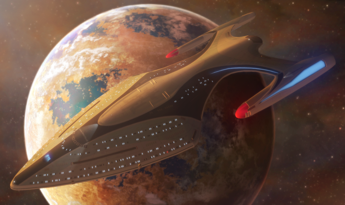
[/SIGPIC]
[/SIGPIC]
SUPPORT LOGICAL FEDERATION STARSHIP DESIGNS!
Post edited by cavalerius on
0
Comments
I mean, outside STO, there are thousands of Fan-designed spaceships in general around. And a lot of good ones. But as soon as it comes to star trek - federation designs.... 99.9 % look awful.
In STO the only not canon federation designs that do not look crapy... do not look federation.
I dont know why that is so hard.
The real problem with the Federation is that they have a really specific design fold that their ships fit into. Klingon ships are easy to create because of their design fold being ugly brute = perfect Klingon vessel THAT I WANT. Romulans just need sleek birds...
I think it's fair to say that Cryptic should have seen the easy ways of fixing the Chimera and Avenger though. If they decreased the bulbous belly of the Chimera then you'd have a fantastically sleek perfect Fed ship. Likewise, the Avenger has to have that neck inverted.
By the way, who came up with the inverted neck for the Avenger and Regent?
CLASSIFIED
[/SIGPIC]
This is personal opinion. The Dyson Vessel, Avenger, and Chimaera are not supposed to look appealing. They even explain in the dev blog for the Avenger that the artists purposefully were given the goal to make it seem built for utility and war.
Beauty is in the eye of the beholder, but each of those ships you describe were not intended to resemble the aesthetics of the Star Trek we know, outside of basic design. However, you can argue that the Avenger and Dyson Vessel borrowed aesthetics from the Intrepid. With the fleet pylons on the Avenger, I've mistaken it for an Intrepid on numerous occasions without giving it a closer look and/or targeting it.
No, it hasn't. The Odyssey and Chimera are both fan-made designs. The Chimera was one of the contenders for the Enterprise-F. One of the ships you are critiquing are from the fanbase, not Cryptic.
There is a very messy legal proceeding involving fan-designed ships and STO. Minecraft and Bridge Commander have the luxury of being open-source or abandonware. Cryptic has paid employees. I'm not sure they're willing to replace JamJamz with cherry-picked artists who do this as a hobby.
But they are always hiring more artists (and they've said as much). It might be prudent to suggest the artists in the populations you describe to apply to work at Cryptic. Cryptic can't take unsolicited designs as a matter of policy.
Mebbe unpaid interns?
EDIT: oh and half of the things in "morelikethis" are simply fan-art of canon designs. A lot of the others are either weird, or dull. There's a few that would be cool to see, but only a few.
My character Tsin'xing
I'm not sure what educational institution would accept Cryptic as an appropriate place to have an internship at.
If I was a college professor for computer software development and I heard an Executive Producer respond to criticism of constant service interruptions, emergency maintenance, and unexpected downtime with, "Sometimes bad things happen for no good reason."
... I'd probably say "Nope." when it came to internships there.
Not saying it's a bad idea.
Just that I wouldn't do it if I were a college professor.
My Ship Builds: USS Conqueror, HMS Victorious, HMS Concord, ISS Queen Elizabeth, Black Widow III
Click here to view my DeviantArt.
Another thing is how is Cryptic supposed to get more Profit from releasing ships that have good stats but are ultimately ugly? When Avenger and Chimera were about to be released they revealed beauty picts of the ships, and we were all like gimme! Then they released it and we saw the belly and necks and hesitated from buying them, to the point where we thought TRIBBLE it ill wait for another ship to be released, and then more disappointment...
Deadly alluring ship vs Deadly yet ugly vessel...
I think ill go for the former.
As for the fan design sites, about 2 out of 5 designs are good usually. That rate, they're well ahead of Cryptic. If they got inspiration from those good designs, the Fed fleet wouldn't be an eyesore.
CLASSIFIED
[/SIGPIC]
Also opinion. I personally disliked the design of the Defiant because it didn't resemble a Federation ship. Later on, I discovered that it wasn't meant to be a Federation ship to begin with, it was originally the concept art for the Maquis fighter (now the Peregrine Fighter), not a Federation design.
I think the Defiant and Prometheus are so well-liked because they were seen on-screen. However, there are only a finite amount of ships that have been clearly seen on screen, and we already have most of them. People (including me) tend to go towards ships seen in the shows and movies.
But Cryptic can't make a sustainable business model on that, so new ships are required. And the Avenger resembles a Federation ship to a much greater extent than the Defiant does. It has a swan-like design we're used to seeing, and as I previously noted, I've mistaken it for an Intrepid at times at long distances.
There are players who will fly a ship that looks ugly for the sake of having good stats. That's just an MMO fact. And keep in mind that beauty is in the eye of the beholder. There are players who have characters who are purposely intended to look ugly and unattractive, or players who put on eyepatches or have scars -- and find them attractive in their own way.
I don't consider the Federation fleet to be an eyesore. To each their own, though.
Now imagine this: Cryptic provides customisation for all the new ships that have recently come out, like they used to do. One bulky brute, a semi bulky/sleek ship, and a sleek ship. I can bet for one that ESD would feature way more sleek Fed ships than the bulky variety.
Also, I have noticed a number of posts over the past two months calling for more ships with a likeable design that are aesthetically appealing. I have also noticed posts calling for another option to change the Avenger's neck so it's no longer a hunch back, and to fix or add the option for a smaller belly with the Chimera. If those people and I are thinking the same thing in these forums, chances are a lot of other people in the STO gaming community are thinking the same thing.
All I'm asking is to balance out the ship designs...
CLASSIFIED
[/SIGPIC]
Oh and one of my absolute faves from canon, that is a very non-fed design.... the Delta Rana ship.
My character Tsin'xing
The dyson is goofy looking. 85% of the issue is the color scheme; it does not fit the shape.
Avenger is not that bad, but its sort of a failure to use the basic pizzacutter frame while trying to do something new with it.
And ^^^^ there lies the problem. Trying to keep using the basic circle on a tuning fork design yet make it distinct leads to repetitive shapes none of which stand out and all of which look off if one wants to be flying THE enterprise. They need to just make a new shape and have done with it.
http://johneaves.files.wordpress.com/2009/03/starship-a-color.jpg
I want something like these as a Fed escort. A simple saucer/hull/2 nacelle design.
^^^
I would also like to see a Fed design like that, but it seems that Cryptic wants to create really wacky Fed ships that are poor offshoots of the tng universe.
Now I could see the Vivace class design being a variant of the Intrepid in STO, and it would be great to update the old canon variants, and add customisation to the new ships that have come out. I would however like to see some traditional Fed designs coming out of the dev team every now and then. For those of you who are unsure of "traditional Fed design," that is ships that don't have unnecessary fins or hull protrusions or any hull with a ridiculously weird design far from the Fed design norm.
The imperial class is worst in this aspect, then would come the Dyson ship (understandable cause it's alien influenced), and those ships with the hunchbacks would be next. Actually I'm going to stop there before the haters really start hating.
As for me personally, fan designs I really like that embrace the Federation design norm is the Century, Vivace, THE ARGONAUT CARRIER!, Jigoku class (http://jetfreak-7.deviantart.com/art/The-Next-Level-271837029) and Proteus class to name a few.
Anyone like these designs as I do?
CLASSIFIED
[/SIGPIC]
A shame really, because that really looked lovely and I'd gotten used to it being the Ent-F from my days modding bridge commander.
It kinda reminds me of some of the discussion that came out in the "design the next Enterprise" contest. One of the entries looked a lot like a hybrid of a Galaxy and an Excel but with pencil shaped nacelles.... Too much been there, seen that. the "fan favorite" design was in a similar situation. It was nice and looked very much like something that I would have expected to see in the TV show. Which was why it LOST. If you saw it and didn't know the source it'd have been easy to mistake it for a canon ship design. It just didn't do anything NEW....
And those ships you linked.... look like modified Novas. Meh.
My character Tsin'xing
And I like it because it's "boring." Because it's simple. Is that a crime? :P
Well thats the thing. Thats exactly what makes Federation ships look Federation. Simple hulls, no need to waste resources on random hull protrusions. The Federation's at war and metal simply doesn't grow on trees. Look at the Constitution, excelsior, Miranda, Galaxy, Akira. No hull protrusions, even during peace time. All boring, yet iconic designs.
Cryptic thinks 'YES! Protruding hull plates, AND FINS! Makes the ship go faster and look cooler!'
Incorrect. That's why the Imperial class is the worst Cryptic designed ship. Tail fins, hull protrusions. They destroy the look of a aesthetically appealing ship, and Tuvok agrees with me:
https://www.youtube.com/watch?v=BdFCjqsbkig
CLASSIFIED
[/SIGPIC]
The problem is that everyone has a different idea of what an 'appealing ship' is. I agree with everything you said in this post; it's been one of my gripes with STO since launch. Even the hull materials annoy me because they have so much detail on them they often look like someone has been attacking the ship with some kind of cutting tool.
But to my mind, efforts to make ships look sleek is part of the problem rather than the solution, and I usually point to the Ambassador class, or the Kirk era ships (the Oberth being a particular favourite) as examples of what makes an aesthetically pleasing design. I feel everything from the Defiant onwards try too hard to look cool, and are spoiled as a result.
Long story short, one person says there should be more ships like X, another says there are already too many ships like X and we need more like Y. Cryptic is trying to appeal to a very broad spectrum of tastes here.
That, or a 2409 successor for that ship sharing the general design scheme (Long, flattened appearance, flat planes with not so many curves, etc), because it's hard to mess up the Trek feel of that design style.
And then I'd be happy. In the way I'm happy to see a Regent or Venture flying by.
To be honest, the only reason I don't like the Avenger is that it just looks like a blocky toy, rather than a huge starship armed with WMDs. (And yes, that neck does kill it, should not have extended all the way back on the hull like that.)
My memory is a bit hazy on that one but wasn't the problem with the Century class that the designer is Canadian thus not permitted to enter a contest resticted to U.S. citizens.
And that it was entered into the contest by an American who was pretending to be the designer?
I believe it was submitted by a whole bunch of different people; unless I'm thinking of a different design. It seems so long ago...
I associate the case in question with this picture:
http://s3.mmoguildsites.com/s3/gallery_images/329609/original.jpg?1312294481
HMM it's certainly possible it was submitted by several people.
I might have only gotten wind of one of the cases after all.
Yep, that's the one.
The designer, going by the name "DJCurtis", is a Canadian and entered the contest early on before the rules were "clarified". From what he told me, he actually received an email telling him he had won and then 5 mins later received another that he had been disqualified for not being in the US (aka, the goalposts shifted).
There was also the case of numerous others trying to pass off the work of others as their own.
Simple answer: they never had any ships in the Prime Timeline we knew of.
And my guess is that they'd have the most inconspicuous ships you'd ever see...like any intelligence service that intends to keep a low...lower...lowestest profile.:)
Nonsense like the ship the romulan bad guy used in the new movie, now that is random hull protrusions and stupid. I do not want to see a lot of this -- too much of it already.
You don't need that junk to make an efficient shape, though. A triangle, a cylinder, a Y, and thousands of other simple, yet pleasing shapes and designs can be used. The tendency is to go for aircraft derived space ships with wings and all but IMHO watercraft make better shapes in space. Simple and efficient.
This gets to the heart of the matter right here. I have a very different view on "appealing" than the next Trek fan, who would have different views from the next and so on. It is all subjective.
Take layout, for example. Personally I think a lot of designers are too afraid to deviate from the standard Constitution layout. I like them just fine, but we have a lot already and adding more and more and more just gets stale. My favorite ships from the shows were the non-traditional ones, the Mirandas and Nebulas and Defiants. Obviously not everyone agrees with that.
I like a lot of Cryptic's 2409 designs. Especially the "updates" like the Venture, Exeter and Regent. I don't particularly like the Avenger, but that's ok, not everything in the game has to appeal to me. I know people who love the look of it.
And here's another headscratcher, sometimes I like unattractive ships! Had a discussion a while back on twitter about the Tal Shiar battleship. Friend of mine said it was ugly, and it is, but that's why I like it. The ship's appearance fits what it is and what it does. Same with the Hirogen ships.
But I don't require anyone to agree with me. For my money, I want both attractive and unattractive ships.
My character Tsin'xing