Graphics look so ugly after expansion

implode
Posts: 98 Arc User
If you google for PWI, the top search result say "PWI, the visually stunning..." Well... not anymore. I thought I'd actually post a side by side comparison of screenshots taken before and after the latest expansion, as the instant I start talking about graphics problems in the expansion people immediately jump all over thinking I am talking about FPS and older computers. Its not that at all, frame rate wise it still runs fine for me, it just looks awful. The thing that drew me to PW in the first place was the character editor and how you could make beautiful customizable chars, and meeting nice people in game and seeing the effort they put into making pretty chars and the fashion they've bought for them. Over 10 years my PW screenshots folder has about 64,000 pics and takes up 680 GB.
Now I just can't any more nice looking screenshots and made me lose all desire to play anymore.
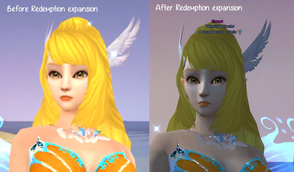
Now I just can't any more nice looking screenshots and made me lose all desire to play anymore.
- "Soften" used to give chars nice warm glowy looking skin. In latest expansion all it does it seem to brighten everything a bit.
- Holding the mouse pointer over a char used to max out ambient light on them so they'd appear in full lighting even if it was in a dark area and nighttime in game, so it was clear who you were going to click on. But this was great for taking pics too. Now holding the mouse pointer over a char barely does anything at all, they look a fraction brighter but are still covered with shadows and ugly lighting effects.
- The old rendering engine still does exist in the game - you can see when you click on a char and in the centre of the screen it shows their mini portrait of who you have targeted, that is still being rendered by the old engine, so is your own portrait when you hit 'c' and in the top left corner of the screen. So the code still exists, why can't we just have an option in graphics settings to choose to use the old engine?

0
Comments
-
This content has been removed.
-
I think she looks best in the old graphics, But still i do think if you maybe adapt to the new graphics (makeover scroll) then you can make her look alot like her previous self. Such as lighting the hair to a cali blonde instead of a yellow and closing the openingness of her eyes and lastly playing with her jaw structure to smooth it out might even make her look better than before.
Above is totally subjective however, But what i meant is that, it doesn't look like that character got that effected and you might can even see it as a new beginning.
edit: actually i just tested it, i cant give a image of how he looked before the patch. But after the match, i had noticed he pretty much looked unchanged in the character photo, but zooming in, his facial structure was a tiny bit different, and the eyes had Bags under them. The jaw wasnt much of a problem, but i couldn't stand the sleepless eyes. I checked in the creator (on a character i never plan on using (new char)) and i saw that if i select new eyes the bags goes away and i pretty much just made new ones all together.
Big problem right? Eyes are the hardest thing to fix in pwi i found out personally. But for some reason, it was alot easier to make his eyes this go around. I am using a ini that i created in 2011, and refined over the years. I put a image down below that can maybe explain it better.
All of the human-skin themed characters have different eye textures now. (Not new eyes to choose from, but a new texture to them that makes them look more evil) but its actually what i meant in the first post before the edit. you can make them look alot better then they look now after the update with makeovers. it's not completely hopeless though.Post edited by mechabeastmc666 on0 -
This content has been removed.
-
Too much lip gloss all of a sudden
 0
0 -
I’m surprise ppl play this game for “graphically stunning” and would be willing to quit NOW when the market has had so many better looking games hell even the best graphically looking game Black Desert Online got remastered (like it needed it right?) js there’s a rather large collection of other games for you if you care that much to keep you in a game.105/105/105 Seeking ScallyMode
http://mypers.pw/5/#2589580 -
One thing that I've noticed is that the terrain in certain spots are in lines. Maybe I'll edit it with ss's later but my terrain setting is on max and it looks like ****.lvl 101 ea from Lost City.
[SIGPIC][/SIGPIC]0 -
This content has been removed.
-
One thing that I've noticed is that the terrain in certain spots are in lines. Maybe I'll edit it with ss's later but my terrain setting is on max and it looks like ****.
Have almost the same: terrain is nice however the water is turned into blocks (only the parts in the shadow). But in overall the screen looks much better than before the update.0 -
I’m surprise ppl play this game for “graphically stunning” and would be willing to quit NOW when the market has had so many better looking games hell even the best graphically looking game Black Desert Online got remastered (like it needed it right?) js there’s a rather large collection of other games for you if you care that much to keep you in a game.
It's not the graphics quality that some ppl r so attached to, it is the graphics versatility in PWI. In other words, the customization and ability to create with the available graphics unique and original characters (and even original fashion sets to fit them). The customization of it all is what wins us over to stay with PWI rather then go to better graphics quality games where we can't be the designer of as many details.
That being said, of course we all still want graphics to be the best quality PWI is able to offer us without creating a whole new game all together. In a whole new game we would lose all the things we value and worked to build up for 10 years .. gear, fashion, friends & the countless hours of designing through the years of out characters and Homestead ...things that we became proud of and attached to. So, when there is a change that some1 sees as a downgrade in a loved game then of course they won't be pleased. It only makes sense to let PWI know, as with anything, if there r enough ppl unhappy and complaining then IT is what prompts action to be taken to resolve whatever the issue is.
*****************************************************************************
There r 2 main differences I've noticed as of the Redemption expansion.
1st is that the way water is rendered is different. This may only be noticeable if u r used to playing with the setting on max but I personally prefer the old water rendering better. Now the water has a ton of tiny ripples everywhere o.o is it that windy in PW? I mean i could see having a ton of ripples in some sections but it's everywhere with no size difference and it makes it look fake ... like i said, my own opinion, i don't like it or the way the sun/moon reflects in it now so strongly, It's too much and makes it look over done and more fake. The old water looked more tranquil and pretty.
The 2nd graphics difference is more of a glitch and hopefully will be fixed with maintenance. The setting Warp is now on 24/7 with no way to turn it off. The check box associated with it no longer works to turn it off. This becomes a problem when u cant turn it off due to lag or even for visual reasons. Some ppl prefer for everything NOT to be moving constantly like under water or by forcefields like the 1 in UPD around the 1st boss. It can be a huge distraction for game play and some ppl even complain that the constant movement makes them nauseous. So it's kind of an important setting to be able to turn off.
@implode As far as the Soften setting goes, I've never liked it except for ss for which it was great. For game play though it made things way too blurry and blinding for my taste but u r right, if ur 2nd ss has soften turned on on it, then yes, it definitely does not do what it used to. Hopefully the currently on going planned maintenances to Tideswell will address some of these things on our server and if the other servers are having issues also then hopefully it will be addressed there as well."BE the change you wish to see in the world." ~ Gandhi ~
~ ~ ~ ~ ~ ~ ~ ~ ~ ~ ~ ~ ~ ~ ~ ~ ~ ~ ~ ~ ~ ~ ~ ~ ~ ~ ~ ~ ~ ~ ~ ~
"The greatness of a nation can be judged by the way it's animals are treated."
~ Gandhi ~0 -
 Put on a Pumpkin and scroll complete close to ur toon .... u'll be bald

 0
0 -
This content has been removed.
Categories
- All Categories
- 181.9K PWI
- 699 Official Announcements
- 2 Rules of Conduct
- 264 Cabbage Patch Notes
- 61.1K General Discussion
- 1.5K Quality Corner
- 11.1K Suggestion Box
- 77.4K Archosaur City
- 3.5K Cash Shop Huddle
- 14.3K Server Symposium
- 18.1K Dungeons & Tactics
- 2K The Crafting Nook
- 4.9K Guild Banter
- 6.6K The Trading Post
- 28K Class Discussion
- 1.9K Arigora Colosseum
- 78 TW & Cross Server Battles
- 337 Nation Wars
- 8.2K Off-Topic Discussion
- 3.7K The Fanatics Forum
- 207 Screenshots and Videos
- 22.8K Support Desk


