test content
Logo
What is the Arc Client?
Install Arc
Blackredders - CO's #1 Fashion Sin
 rokurocaris
Posts: 1,074 Arc User
You probably noticed there are MANY characters running around in pitch black costumes with details and patters in a bright glowing neon color, which is red 9 out of 10 times. Their costumes are usually cobbled together from the most imposing pieces they could find (bladed bracers and shoulder pads, halos and highly detailed armor are very common), lacking any actual concept, and possibly backed up by a Dark Aura. Or they simply use default costume pieces which are available for first-time-players. But anyway, only a very few "blackredders" manage to look anything but awful.
These players think that their costumes are dark, edgy and all around awesome, while they are in fact an eyesore to look at and way too common to be considered anywhere near original.
Now, this is not a name & shame thread, mind you. I will post pictures of really bad, as well as of the few good looking blackredders I come across in the game, in order to show how it's done wrong, and how it's done right. But I will not reveal their players' @handles! I will show particulary ridiculous character and SG names, but nothing more. I'm ridiculing a trend here, not the people following it.
And ofcourse, everyone is welcome to add their own pictures and discuss the costumes shown.
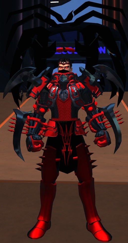
Here we have a prime example. Lots of cool and impressive costume pieces, even Therakiel's Wings, and all in supposedly dark and edgy colors. But does it look good?
To me, this does not even look like a character. It's more like a manequin the player uses to show off his collection of cool costume pieces, a walking display of status symbols. What baffles me the most is that after all this time it must have taken to get these costume pieces, he didn't bother investing a few more minutes into using them for what they are made; creating a cool looking costume.
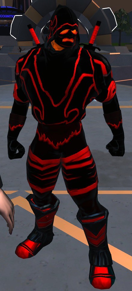
Kinda funny how many blackredders are also supposed to be ninjas. Those colors make Naruto look stealthy by comparison...
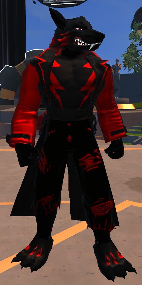
Also very common: Furry blackredders. We know their tendency to create characters with unnatural features and colors, but most of them put at least some effort into their creation. This is not one of those.
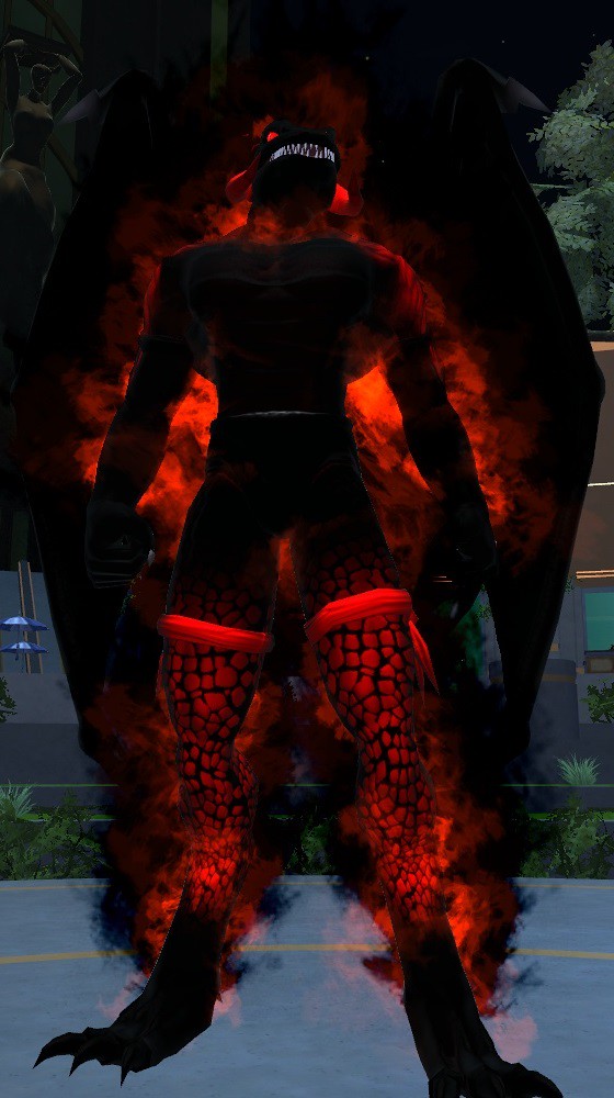
Here we have one abusing Dark Aura. The character is huge, with wings and claws and a reptile head, but what else is there to say about it? There is really nothing special about this character. It's a huge, dark, roughly dragon-like piece of nothing. And the aura only underlines that.
These players think that their costumes are dark, edgy and all around awesome, while they are in fact an eyesore to look at and way too common to be considered anywhere near original.
Now, this is not a name & shame thread, mind you. I will post pictures of really bad, as well as of the few good looking blackredders I come across in the game, in order to show how it's done wrong, and how it's done right. But I will not reveal their players' @handles! I will show particulary ridiculous character and SG names, but nothing more. I'm ridiculing a trend here, not the people following it.
And ofcourse, everyone is welcome to add their own pictures and discuss the costumes shown.

Here we have a prime example. Lots of cool and impressive costume pieces, even Therakiel's Wings, and all in supposedly dark and edgy colors. But does it look good?
To me, this does not even look like a character. It's more like a manequin the player uses to show off his collection of cool costume pieces, a walking display of status symbols. What baffles me the most is that after all this time it must have taken to get these costume pieces, he didn't bother investing a few more minutes into using them for what they are made; creating a cool looking costume.

Kinda funny how many blackredders are also supposed to be ninjas. Those colors make Naruto look stealthy by comparison...

Also very common: Furry blackredders. We know their tendency to create characters with unnatural features and colors, but most of them put at least some effort into their creation. This is not one of those.

Here we have one abusing Dark Aura. The character is huge, with wings and claws and a reptile head, but what else is there to say about it? There is really nothing special about this character. It's a huge, dark, roughly dragon-like piece of nothing. And the aura only underlines that.
Post edited by rokurocaris on
0
Comments
The same in purple. It's the second most common color of choice for blackredders, but not really any more original.
This one also inverts the concept of the dragon in the previous post, but not for the better. Instead of a black mass, we have a bright purple mass here. That's the problem with extreme contrast colors: One easily overshadows (or overglows) the other.
A common problem with many blackredder costumes is that the designers seemingly couldn't decide if it should look hi-tech, low-tech, martial, bestial or mystical. Or they just didn't care.
See, you don't even need rare or outstanding costume pieces to look a̶̶w̶̶e̶̶s̶̶o̶̶m̶̶e̶ awful!
Also, using a tertiary (third) color is no guarantee to avoid that.
Two in one picture. The one on the right could have looked good, maybe, if he had taken the time and effort to choose better colors. But instead, he just picked black, red and white. Also, notice how he the bracers and collar have the Broken detail texture, but the shoulder pads don't. Those are signs of laziness.
The one on the left is a truely extreme example. The character itself is all black, with no visible features, except for the eyes. The sole concept behind this costume appears to be "Look, Psi pieces!"
What you should avoid in order not to end up looking like this:
Don't use only the darkest black at the very bottom of the color palette.
That one is a negative color, so dark it actually makes certain transparent parts invisible. It is best used for shading or "void" effects. But for a black surface, the second darkest black is dark enough.
Don't use only the brightest neon colors.
Sure, dark and bright makes a good contrast, in theory. If you want to play "dark" characters, would it really make sense for them to be colored like rave party people? And even bold and heroic "capes" usually don't dress up in the brightest colors.
Don't use only two colors.
There is more than black and red, you know. Take Spawn for example. He wears black tights and a red cape, but also has white markings, silver chains and spikes, and green eyes.
Contrast colors rarely make good secondary colors.
If a costume consists only of two opposing colors, such as dark black and glowing red, it looks kinda like the costume is trying to tear itself appart. And no, that's not as "edgy" as it may sound! You will get much better (and eyefriendly) results if you make the secondary color harmonize with the primary, then using an outstanding, contrasting tertiary color for small details.
Don't overdo it with the glow.
Glow looses its effect if there is too much of it. It works better for a few special details such as gems or energy cables. If everything glows, nothing of it stands out. Also, you don't need to turn the glow up all the way to 10. 3 - 5 is usually enough for notable glow, and 2 for subtle glow. (1 doesn't seem to do anything...)
Cool pieces do not always make a cool whole.
As I said before: Our characters are supposed to be characters, not manequins to display your best costume pieces. Costume pieces should serve the character, not the other way around!
Unreasonably mismatched pieces just look wrong.
Try to be consistent. A good costume looks like it is one piece, not a bunch of single pieces thrown together. It's not a bad thing to use different forms, patterns, details and materials, but if you do, try for the whole picture to make sense and look good.
Not everything looks better with auras.
Simple as that. An aura adds another accent to your costume, but does not necessarily improve it. The same goes for aura-like costume pieces, such as holo fields. If you add such eyecatches to a bad costume, they will draw negative attention, kinda like you were holding a big sign saying "Ima costume noob lol".
The first thing to notice: There is no glow. It's a tech ninja that actually looks stealthy.
Here we have a black power armor with red glowing details. Emphasis on "details"! The glow is subtle and actually used only for details instead of as a secondary color. The actual secondary color on this one is grey.
This one looks kinda weird, but certainly not everyone has a body like this. That's originality!
Overall, this costume has surprisingly good synergy. The colors are well balanced; red is the primary color, but it doesn't draw attention away from the black parts. Dark grey is used as a subtile tertiary color in between the web lines. And the tights have the same Scale detail and Leather material textures all around.
Also, notice how he colored the holo fields in a dark red, making them more like subtile accessoirs instead of eyecatches.
Notice how they use other colors, which makes the costume look less monotone (duotone, technically).
And they don't just use "cool" costume pieces either, but select them so they fit the character's theme.
Cyber Talon
Condor Oscuro:
Husar de la Muerte: Normal and Armored look
Mercenary
Am I sinning, Master?
lol
As I said; using black and red doesn't make a character look bad. Using only black and red (or other glow), with no concept whatsoever; that naturally makes bad costumes.
Your chars don't abuse glow or auras, their costumes are made with a clear concept and they use tertiary and even quartary colors.
Absolutely nothing wrong with them. I would say they don't quallify as blackredders.
I remember I almost fell out of my chair laughing when I exited the tutorial one day with a dude named "Black and Red"
[SIGPIC][/SIGPIC]
I'm not judging the colors, and not even the ones who use them. This thread is about the improper use, and how to avoid it.
If your G.E.A.R. Enforcer manages to look good in black and red, you are welcome to post a picture of him as a positive example.
Technically it's not even black, it's dark grey.
[SIGPIC][/SIGPIC]
What is that hip piece? Never seen that before.
Many times I find cool top pattern but none of the pattern for the lower half which sometimes lead to a situation of three color choices for the top and either going with two and looking mismatched with the third detail color just thrown in there or going with solid color for bottom leaving the character looking like good amount of time and detail spent on top half with the bottom half looking rushed and half done.
But creativity is an art. Some have some don't and depends on subject and area. Even people that get paid f millions to be creative seems to be running out of juice(hollywood).
But certainly, black and red is a nice colour that can look very good if done right. Though, it is a bit boringly common, presumably because Deadpool.
Some of my own examples that, I'd like to think, show how black and red (and white and gold) can be done well...
| The Phoenix - A Fiery Jack of All Trades | The Nightmare - Dark Summoner | The Ranger - Archery/DB DPS |
| The Packleader - Bestial Petmaster |
Because nothing says "celestial" like ax crazy people with a god complex wearing evil looking hi-tech armor. *rolleyes*
This one has at least more than two colors. But even bigger than the contrast between the colors is the contrast between how overdesigned the costume is and how uninspired the color scheme and character concept are. I guess the ideas behind this character were merely "I wanna use ALL the cool pieces I unlocked" and "I wanna be chaotic evil, lol".
Even Rob Liefeld tried harder than this. *facepalm*
I don't even need to describe what's wrong with this one, do I?
Seriously!? *facedesk*
[SIGPIC][/SIGPIC]
Click up there if you want to find more about the costumes behind my heroines.
Perhaps not an excuse, I know, but it gives them a smile and they carry on with less stress about the poorly crafted decisions assaulting their eyeballs.
"Maybe the're 10."
the problem comes when said persons are not kids =p.
But bah lets not get into that discussion and just enjoy the thread.
[SIGPIC][/SIGPIC]
Click up there if you want to find more about the costumes behind my heroines.
Besides, my 12-year-old autistic daughter exhibits better color sense than most of these "designs"...
- David Brin, "Those Eyes"
Get the Forums Enhancement Extension!
[SIGPIC][/SIGPIC]
I wish my 11-year-old nephew had better color and design sense.
I have several toons based on his aesthetics and... they are not pretty.
Most are just variations of Goku or Hulk clones.
And his idea of a great character name -- "Huge Man", "Black Ninja", "Fireman", "Lash Man", et. al.
But he's my nephew... gotta love him.
At least it says so in the fine print.
CellarRat33 :: formerly Bsquared
***
"The great thing about glory unending is that it's dirt cheap!" - Tateklys
From the Adventures of Thundrax (canadascott)
***
Here's a pink one.
And a green one.
And a blue one.
And a yellow one.
And they're all just the same.
Really, red is just the most common color. Aside from the color, there is no difference.
Ohh ohh ohh. Im a black and greener! I didn't even know it was a thing. Now I feel ashamed, or is it odd, or strangely odd, or maybe gassy. Either way, green is cooler then red!
DIEEEEE YOU BLACKGREENER!!!! us blackredders will conquer all of CO with our awesome fashion =p.
[SIGPIC][/SIGPIC]
Click up there if you want to find more about the costumes behind my heroines.
Fortunately, green is a darker color. Therefore we can hide in the shadows better and mock you. neener neener
Sooooooo, what color combinatations can be used. Seems alot of them got ruled out that isnt a bright pink/green/yellow thing bright to eyes thing.
Edit: Inferno Goku actually has some potential. It would take quite a bit of refinement, but there is something good trying to happen there.
So... the OP has already said that you just need to avoid the blackest black (aka the one at the very bottom) because its a texture killer so as the neon colors for main outfit colors. They usually end up looking terrible.
Let me quote a small excerpt from bluhman's guide:
That's a more complete answer on why neon colors are just a no no for costumes. Hope it helps
PS: Sockmunkey you know that red means death... just sayin us blackredders are coming for you heretic greeners! =p.
[SIGPIC][/SIGPIC]
Click up there if you want to find more about the costumes behind my heroines.
Ooops. I missed that. My mistake. take out rows 3-6th,
and it either leaves faded colors of the two top rows or the drab dark colors to be a base (including bottom row black and excluding the shades of gray and white.)
Yeah still limits the choices by this rule set and leaves actually a toon looking pastel or dark version of various colors or pastel and dark version of another color. Like a few examples of the red and blacks that was used as example of good one dont look any better than the bright reds/bottom row black. It's looks just as lazy. I
Like the purple demon thing. I kind of like it. It's different twist on demon look. All the details can be easly seen down to the skin texture, compared to the good exmple ninja which looks generic. Another ninja with dark colors, with dark red, stripes. ANother one out of the thousands of others that look the same.
I do like the chick with the armor.
I mean, who cares if their costumes are hideous....as long as they like em? To each his own and whatnot?
And then there's that whole "post-it" thing, you wanna get all philomosophical and stuff. Meaning: the adhesive on post-its was a mistake...it was too weak to hold anything heavier than a small piece of paper, and the rest is history. Similarly, one of these mistakes will turn out to look pretty cool one day.
Think of the black-redders as monkies and the character creator as a typewriter -- sooner or later, you're gonna get a "War and Peace" and when that happens, all the other faux pas ("pases"?) will have been worth it.
imho, of course.
The saturated band can sometimes be used for main colors, but usually just one, and then you will need a very mild color go with it.
It can really depend on what costume piece is receiving the colors, because they have them in different ratios. I often find myself coloring many of my pieces individually, just so that I can control where the colors are applied, even though most of them use the same colors.
Even if you want a Tron look, having a neutral color to go with the extremes can help a lot.
Here are a couple of examples i did to help with the explanation.
For my Death Knight. (Yeah... i know what you're thinking..) i used plated armour for the character, bascially armour with similar styles that would match up together. The Light purple glow has been used on the skulls and skulls ONLY to make them stand out and give it a more lively look.
Original is here: As said before, red seems to catch the eye, i didnt use the most saturated red there, but i used a few colors down from the brightest one so its still fairly eye catching.
Additionally this is another black and red costume that i get a lot of comments out of. Concept? Chaotic power armor. Just a little experiment i did a long time ago. Again same thing has been done here except with only the black parts of the armor.
Last but not least, another cyborg ninja. This is another example i used with contrast, no hes not a black redder but he does use the colors. I have used red in very specific places around his armor to make certain aspects stand out. If you want to make a ninja, avoid using very saturated colors at all costs. Remember ninjas are stealthy and don't want to be seen, if you run around in a fluoro (Meaning very bright colors) costume, im sure everybody ought to notice. Try using faint colors, but not too faint that both colors aren't distinguishable from each other.
A word of advice when trying to pair up parts for your cossie. If you're trying to look for something slick and fast looking (For example) Try and get a piece that doesnt have a lot of spikes. and match up pieces with the same of style. A few pieces from a set is okay, but if you get other pieces from other sets and still make it flow, then fantastic! Also dont be afraid to experiment with colors inside the tailer! Remember effort takes time and nobody sees what your making in the tailer anyway, so those extra minutes you spend in there to make a better costume are worth the time! Trust me! Don't be put off is you see someone with a better costume, it takes a while to get to know what you want to make.
Anyway i hope this helps anybody stuck for color schemes and such. Cheerio.
Handle:@XG3NX
Champions Online.. where we sell lockboxes by the dozen.
There's a saying in writing that any professional writer needs to throw out the first million words they've written before they produce publishable work. I think similar principles apply to the development of any aesthetic skill.
The fact that colors and shaders look different in game from the way that they look during character creation and in the tailor or green room doesn't exactly help.
Also, that blue-grey is one of the game's best kept secrets. x3
I'm still waiting for a grey-grey....is hex code #333333 too much to ask?
First of all is one of Swashbuckler's costumes...........................................
And here is Nightingale's modern hero look................................................
Click here to check out my costumes/milleniumguardian (MG) in-game/We need more tights, stances and moods
Those are WONDERFUL examples of how to make wonderful costumes with these colros. BRAVO... love them all.
The... examples posted by Rokurocaris... brrr... made me shiver... so... awful
Millions of dollars will be spent to wear black and red and have multiple personality disorder and play the Specialist against what looks like essentially some Viper guys.
One more knife in CO's back while you complain about the people actually playing the game.
Next nemesis! x3
I don't complain about people, I'm criticizing a fashion trend.
But speaking of the people...
This is how "Dark", from page 2, looks now. He also joined a SG with a less silly name.
And this handsome devil...
looked like this a few minutes later.
Small improvements, but still better than none.
You see, it's not like tailoring skills and creativity couldn't improve.
I wish I could play with the settings this high. I can't even use the material shaders. :<
Jaguar
The Black Knight (Alternate Oufit)
Gun Sexy (Riding Hood Outfit)
I don't really think they look bad, and I wasn't influenced by a 'trend' either. I just felt that it was logical for the characters. We should also remember that this Spider-Man fellow started out as a Blackredder...
Spidy has never looked better than when originally drawn by Ditko as far as I'm concerned. Adding light blue to his outfit changed the whole feel. Lee approved Ditkos version over Kirbys because he wanted Spider-Man to look 'scary.' so Blackredders are just as valid of a costume option as any other color combination I think, especally if you are going for a threatening look. That red looks pretty 'neon' too.
The real 'problem' (not that I would ever suggest people change they way they design, as good and bad are subjective) with most blackredders is that the players have seemingly hit the random button, then changed all the colors to black and red without thinking about the design.
But if you don't care about your hero design (which I think most people, silvers especally, don't) I can't blame you for just wanting to get the costume out of the way and start playing.
Spider Man never wore neon red or black so dark you couldn't see his muscles anymore. :redface:
By that definition, the only typical blackredder amongst your characters is Jaguar. Whose costume is otherwise great, I got to say.
And even as a blackreder, he plays with a different hue of black making the costume more interesting, since you focus on the details
Now I kinda want to see that lol... a totally black spiderman with neon red xD.
This whole topic reminds me of Blood Dragon... yeh.... NEON POWAH!!
[SIGPIC][/SIGPIC]
Click up there if you want to find more about the costumes behind my heroines.
- David Brin, "Those Eyes"
Get the Forums Enhancement Extension!
Last picture does seem to be going somewhere. The red spots on the legs amongst all the black darkness makes him look like he's only showing subtle hints of a figure in full shadow. If he put more of those red spots on other parts of his body it would be better. And lose the red leg bands.
Grappling/Wrestling Power Set Suggestion 2012-2013
How a Wrestling Power Set Can Work
Not COMPLETELY black-red...
"Champions-Online and Star Trek Online contained hundreds of hours of mediocre content!"
and "nothing was polished".
--Jack Emmert
BUT completely awesome.
The Brimstone Kid - He controls fire and lava.
Kyrin the Great - A stage magician that uses props/gadgets and tricks to fight crime.
My Characters on PRIMUS
Toons and costumes thread
@Benevon
Leader of Super Serious Brooding Vigilantes