Quest log font

Xainou - Sanctuary
Posts: 5,369 Arc User
Could we please revert it to the font and font grade it was before the update? Looking at it now hurts b:shocked
[SIGPIC][/SIGPIC]
Licensed tail brusher of ƙɑƙʊɱɑʊ ~ only the fluffiest
Outrunning centaurs since 2012~
Licensed tail brusher of ƙɑƙʊɱɑʊ ~ only the fluffiest
Outrunning centaurs since 2012~
Post edited by Xainou - Sanctuary on
0
Comments
-
Agree! Not nearly as bad as when they added the tags to chat window tho imo.0
-
Xainou - Sanctuary wrote: »Could we please revert it to the font and font grade it was before the update? Looking at it now hurts b:shocked
was the first thing i saw soon i logged..... i though
first caracter names in game with a funky font, now quest log, soon they 4get to translate patch and we play in Chinese caracters XD
but i think its easy to revert this issue... they probably didnt even noticed, or if so they left it to last cause was easy and simply 4got it0 -
The font looks fine on my end; can you post a screenshot of what you're seeing?==/Senior QA Lead/==
Surtr from the south wielding fire
The gods' swords shine in the darkness, like stars in the night
Mountains collapse into rubble and fiends shall fall
Man walks the road to ruin as the sky splits in two0 -
Sure, here's what my old one looked like:
http://tinypic.com/r/w2k489/8
And here's the new one:
http://tinypic.com/r/313g7rp/8
Thanks for the fast response Surtr. Any chance we can get tags removed from chat? b:chuckle0 -
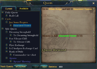
I agree with this. I complained initially when they changed the NPC's text boxes (when you pick up quests) to this font because I found it difficult to read. I have since had to resort to mindlessly clicking responses and not reading the quests, which bothers me.
When I logged in yesterday and found the quest screen the same, I was very upset. I need to be able to read these to find out what mobs to kill because tracking doesn't always tell you, and honestly it gives me a headache. It is the combination of new font/size of font - the new font would be fine if you would size it up a bit, or if you want it small go to a cleaner font. Right now it mostly blurs together for me.
I know some people have no problem with this but you have to take into account screen size - some of us are using laptops that don't have screens as big as others have.[SIGPIC][/SIGPIC]
Annalyse (veno) - Melosa (cleric) - Glynneth (archer) - Pickerel (sin)
Florafang (wiz) - RubixCube (barb) - Laravell (psy) - Diviah (Mystic)
Torchwood (BM) - Sataea (Seeker) - Wystera (Sin) - Allissere (SB)
Looking for a mature faction on HT? pwi-forum.perfectworld.com/showthread.php?t=7608420 -
The font looks fine on my end; can you post a screenshot of what you're seeing?
The font is fine, the problem mostly is that the font has become bigger, which to people with big questlists can be a petpeeve. Though I admit the old font was a lot easier on the eyes to read, especially on those long dialogue-quests..0 -
Yea, the old font is better. I can see how the new font would be harder to read to anyone with sensitive eyes. I liked the old font more myself.[SIGPIC][/SIGPIC]
Retired PWI veteran. 06/26/2010-2014.0 -
The biggest problem is they keep scailing the fonts up in a fashion that can only be assumed is meant to assist those with a higher resolution, but have completely left out properly scaling the UI.
The new font isn't terrible, but it's freaking huge. I'm playing a game, and the last thing I need is the UI taking up more space that what I'm trying to play. It's not like I run super small resolutions either. I'm either windowed at 1600x900 or full-screen at 1920x1080.
Which is another weird thing, HD on my monitor doesn't scale much, but if I put it on my TV with the same resolution, suddenly everything shrinks to a size I would find more acceptable on my PC. I've never understood that.[SIGPIC][/SIGPIC]0 -
SylenThunder - Sanctuary wrote: »The biggest problem is they keep scailing the fonts up in a fashion that can only be assumed is meant to assist those with a higher resolution, but have completely left out properly scaling the UI.
The new font isn't terrible, but it's freaking huge. I'm playing a game, and the last thing I need is the UI taking up more space that what I'm trying to play. It's not like I run super small resolutions either. I'm either windowed at 1600x900 or full-screen at 1920x1080.
Which is another weird thing, HD on my monitor doesn't scale much, but if I put it on my TV with the same resolution, suddenly everything shrinks to a size I would find more acceptable on my PC. I've never understood that.
I'm on a 1920x1080 as well but the font is just huge, I'm not sure how they meant for it to scale with which resolution, but certainly this wasn't the solution.
Btw did you sit as close to your tv as you would with your monitor? :P Could be we are all supposed to sit 2 meters away from our monitor in order to read the fonts properly.0 -
i have issues with the changes to some of the quest naming - divine contracts in morai, for example - which now include all the "contract" labelling at the beginning making it difficult to pick the quest from thellist; then the re-ordering to automatically place all completed at the top, rather than the ones you're working on at the top makes it harder to even find the quest in the tracking list. I believe it also doesn't remember which quests i've elected to not track so they pop up in the tracking list again every time i log on -- example -- since you can't ever get the white emperor reward quest completed and it remains in the list - why bother to track it??? if it keeps getting back on my tracker and i have to keep untracking it, that's highly inconvenient.0
-
The font hurts my eyes too.. but it's probably because PWI changed from sans-serif to a serif font. Same pain I had when the character names were changed to serif too.
Sidenote: I also agree with the post above me. If something is classified as 'Divine Contract', why do all quests that are divine contracts have to have that in their name if they're sorted already? It's just useless clutter. b:chuckle0 -
Wow, I'm a little confused now.... so for many people the new font is bigger? I find it hard to read specifically because it is tiny on my screen. Possibly close to the same size as the previous one but due to the fancier style, the quests in purple/blue especially sort of blur together. It's definitely not bigger on my screen or I'd have no problem reading it.
Edit: I don't have a picture yet comparing quest lists, but it looked about the same as when they changed the quest accepting windows. The new one has the same font as the quest lists now, and you can see the difference in readability here:
http://174.142.61.69/e/1/9d78af35-0720-4511-b0f8-6b97e087cb63.jpg[SIGPIC][/SIGPIC]
Annalyse (veno) - Melosa (cleric) - Glynneth (archer) - Pickerel (sin)
Florafang (wiz) - RubixCube (barb) - Laravell (psy) - Diviah (Mystic)
Torchwood (BM) - Sataea (Seeker) - Wystera (Sin) - Allissere (SB)
Looking for a mature faction on HT? pwi-forum.perfectworld.com/showthread.php?t=7608420 -
Annalyse - Heavens Tear wrote: »Wow, I'm a little confused now.... so for many people the new font is bigger? I find it hard to read specifically because it is tiny on my screen. Possibly close to the same size as the previous one but due to the fancier style, the quests in purple/blue especially sort of blur together. It's definitely not bigger on my screen or I'd have no problem reading it.
Edit: I don't have a picture yet comparing quest lists, but it looked about the same as when they changed the quest accepting windows. The new one has the same font as the quest lists now, and you can see the difference in readability here:
http://174.142.61.69/e/1/9d78af35-0720-4511-b0f8-6b97e087cb63.jpg
These are what my windows look like. The font for the list is bigger but the menu text telling you what to do on the right is either smaller or my eyes are playing tricks on me. xD My quest text when talking to the npc is fine..
http://i68.photobucket.com/albums/i40/ariesdragon123/583f02f2-4316-4145-b89a-4eaef898503a_zpsd4cab163.png
http://i68.photobucket.com/albums/i40/ariesdragon123/adb61be3-29f2-4d4e-b31c-d903ce886f4c_zps592c0090.png0 -
On my PC it's bigger.Verenor - Morai wrote: »I'm on a 1920x1080 as well but the font is just huge, I'm not sure how they meant for it to scale with which resolution, but certainly this wasn't the solution.
Btw did you sit as close to your tv as you would with your monitor? :P Could be we are all supposed to sit 2 meters away from our monitor in order to read the fonts properly.
When it's on my 42" TV at the same resolution, it's like all the UI reduces in size by 50%, which makes it damn near impossible to read the chat box at 10 feet away. If it did that at the same resolution on my PC, with the current font, I'd be happy, but it doesn't.[SIGPIC][/SIGPIC]0 -
Never knew this ended up here o_o;
Anyfur, my main issue with the current font is that it's a thin, serif font on a dark background. Incredibly hard to read even with the current font grade. If you were to go with a negative setting like this, it either needs a serifless font or something with thicker strokes.[SIGPIC][/SIGPIC]
Licensed tail brusher of ƙɑƙʊɱɑʊ ~ only the fluffiest
Outrunning centaurs since 2012~0 -
WTB > Age of Spirits UI paying well pm me thanks0
-
Mraochan - Lost City wrote: »WTB > Age of Spirits UI paying well pm me thanks
I second this.0 -
Comic Sans quest log font when?Soon™
Well, maybe later, semi-retired.0 -
Want the old fonts, and quest arrangements back.. Had to open up Quest list itself to make sense of which is the quest I'm doing. Banners on top of NPCs are annoying too. Whats wrong with the old 1? b:angry0
-
Bump ...[SIGPIC][/SIGPIC]
Licensed tail brusher of ƙɑƙʊɱɑʊ ~ only the fluffiest
Outrunning centaurs since 2012~0


Categories
- All Categories
- 181.9K PWI
- 699 Official Announcements
- 2 Rules of Conduct
- 264 Cabbage Patch Notes
- 61.1K General Discussion
- 1.5K Quality Corner
- 11.1K Suggestion Box
- 77.4K Archosaur City
- 3.5K Cash Shop Huddle
- 14.3K Server Symposium
- 18.1K Dungeons & Tactics
- 2K The Crafting Nook
- 4.9K Guild Banter
- 6.6K The Trading Post
- 28K Class Discussion
- 1.9K Arigora Colosseum
- 78 TW & Cross Server Battles
- 337 Nation Wars
- 8.2K Off-Topic Discussion
- 3.7K The Fanatics Forum
- 207 Screenshots and Videos
- 22.8K Support Desk