test content
Logo
What is the Arc Client?
Install Arc
Options
New GUI is too tabletified and simple
 allocater
Member Posts: 289 Arc User
allocater
Member Posts: 289 Arc User
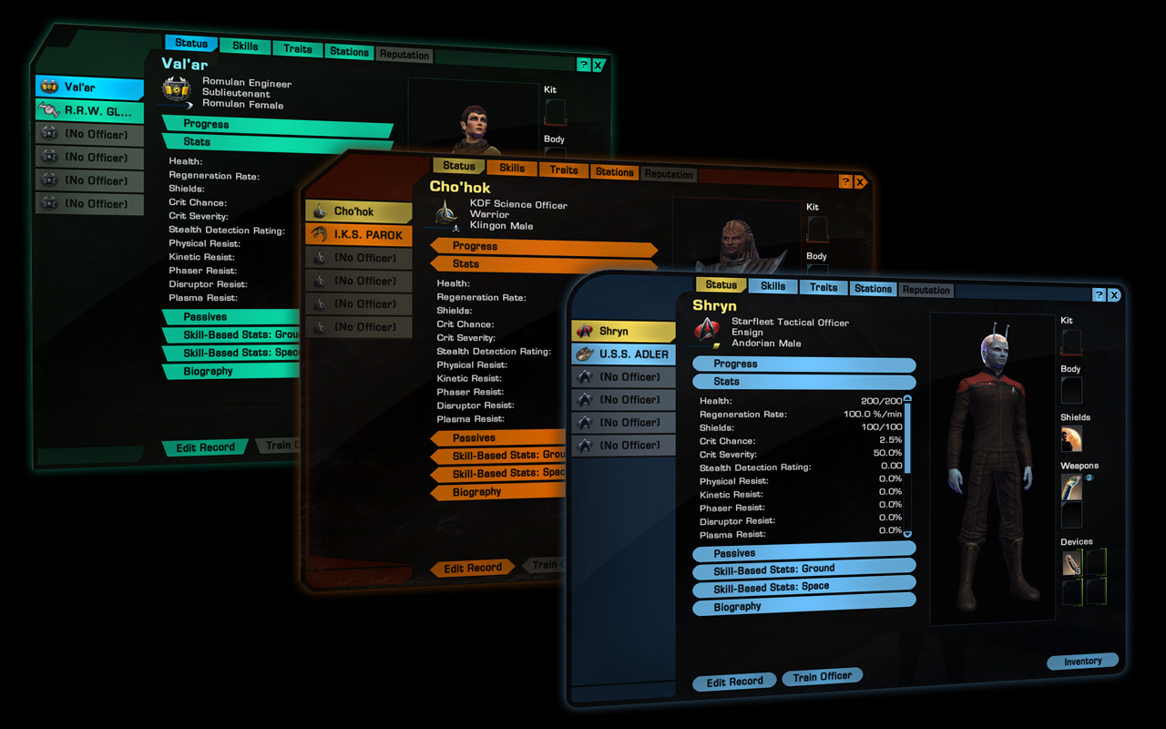
Check this out: http://images-cdn.perfectworld.com/en/sto/redesign2012/legacyofromulus/large/s8.jpg
and compare it with how it is now. Now the buttons have:
-a glowy border
-a shading from top to bottom to make them look 3d
-the text has an outline
-also the equipment fields have lines to the character
in the future
-only 1 color for the button
-text only black
-no lines
a ten year old browser game has more flair than the new GUI
Post edited by allocater on
0
Comments
Proud Leader of the Massive Chaos Group
Proud Listener of Subspace-Radio.net The Voice of Star Trek Online.
[SIGPIC]http://massivechaos.enjin.com/[/SIGPIC]
It may or may not be finished in those pics, so dont take 3 static screenshots of something we wont even see on tribble, let alone live for months, as complete or even a true reflection of how it will look when playing.
I just hope they're using this as a chance to fix all the UI issues such as everything defaulting to your shuttle even if you're currently in your starship, some dialogues being mutually exclusive such as the replicator and your bridge officer assignment menus (very annoying if you need to replicate something to run a DOFF assignment).
Game Balance - Ship Size and Wingmates
Following that aside, without attempting in any way to derail this thread:
It's actually a TOS BoP as the starter ship - the Wing.
Also, not the registry prefix: R.R.W.
It's not the I.R.W. used either by the Romulan Star Empire (formerly led by Sela) nor the I.R.W. used by the New Romulan Empire led by D'Kan. Sela's returning - will it to be lead the RSE or will she be leading some new splinter faction? Cause, Romulans and splinter factions are like the Klingons and Houses, eh?
That being said, though - it will be somewhat interesting to see how the UI feels. Yes, an odd thing to say since we can't actually feel it, but I believe many of you know what I'm talking about. How will it "respond" - how will that feel?
Also, by any chance - is there any chance - that it will do something about the GUI latency, eh?
As far as how it looks/will look - there's no way I could even begin to form an opinion simply from three color schemes of the same thing. There's a lot to the STO UI... will be interesting to see more info as more info becomes available.
set color for buttons/tabs which are selected [ ]
set color for buttons/tabs which are hovered over [ ]
set color for title bar which frames the tabs [ ]
set color for each division type for BO tabs [ ]
and so on...
Like TOS Romulans paralleled the Roman Empire, what's happening right now parallels the fall of Rome.
Originally, Rome had a senate and the markups of a republic, but was in fact a totalitarian empire despite the absence of an emperor. This is how the RSE was throughout the series.
During several times of crisis such as the burning of Rome (destruction of Romulus), an emperor was either given or took power beyond what the republic usually held. This is what Sela did. The last person to hold this position refused to give it up (as Sela has), and dissolved the senate to solidify his power (which Sela did).
This was a factor in the Eastern Roman Empire breaking off (as New Romulus has), and fragmented the rest of the empire between the Emperor's forces (Romulan Star Empire and Tal'Shiar), loyalists to former senators (Romulan Republic, earlier Praetor Taris), and uprisings among conquered people and slaves (Reman Resistance).
This is an extremely simplified version of events, but the RSE was already based on an extremely simplified version of the Roman Empire, it's fair that its fall be based on an extremely simplified version as well.
Judging from the screenshot, all the buttons are still there, we get an improved character view, and only lose a few superfluous indicator lines pointing to where X or Y equips in a flavor sort of way.
Looks like an improvement to me.
I Support Disco | Disco is Love | Disco is Life
Having said that, I'm sure my opinion is just a drop in the ocean of people who love LCARS, and its not worth making a fuss about imho.
In every place,
The deeds of men remain the same..."
True judgement will have to remain until we're all using it and if there are any glaring oversights or bugs though
[SIGPIC][/SIGPIC]